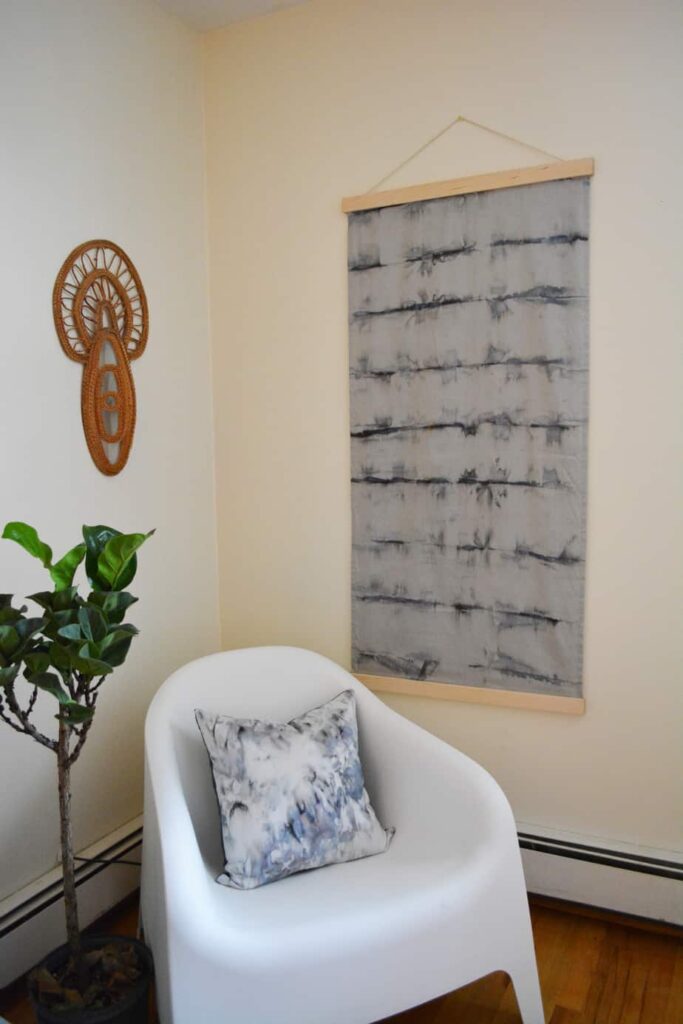
 What makes a house feel like a home is the final touches. Books on the shelves, the centerpiece on the dining table, coffee table books, and most importantly wall art and décor. I’m going to share some tips and rules of thumb for art placement and selection throughout the home. Putting holes in your freshly painted walls can be intimidating; use these tips as a guide and call the experts for help with installation.
Create harmony and variety in subject matter and media
Let’s have a quick lesson on different types of art and media before we get started. It’s important to have a variety of different forms of art and décor to harmonize the spaces. First, let’s nail down the difference between objective and non-objective art. Objective art is something that depicts something recognizable as the subject, a person, figure, flowers, anything. It can be abstract, or not. Think abstract landscapes, they might not be photo realistic, but still evoke the representation of a beach, or mountains. Non-objective art is just the opposite, when you look at the piece nothing is recognizable as tangible in the world we live in. This could be a wash of colors, plaint splatter, or even mixed media.
Not all art needs to be 2 dimensional. There is more that you can put in your home than photographs and paintings. Mirrors, fabric and other textile wall hangings, objects (I have a carved cow skull from Bali hanging above my bed) even clocks or freestanding sculptures on pedestals. By incorporating all of these different types of art forms throughout your house, you’ll not only create interest and harmony, but they will become conversational pieces, and bring you joy from being able to admire them.
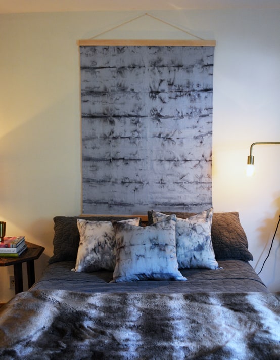
I have a side project making wall hangings out of hand dyed silk. I love using these pieces as “headboards”, statement pieces over sofas, or even adding a little interest to a small reading nook.
Juniper + Fir and Attalie Dexter are also amazing fiber artists. I crush on their Instagram posts nonstop. I’m a firm believer that art in the home should mean something to the owner, and like to avoid mass produced artwork as much as possible.
[one_half]
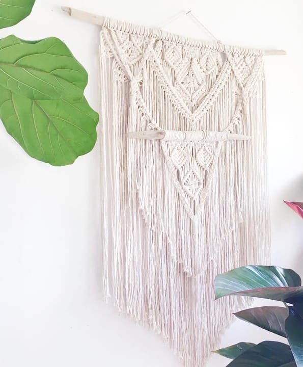
Caspian macrame wall hanging by Juniper + Fir
[/one_half][one_half_last]
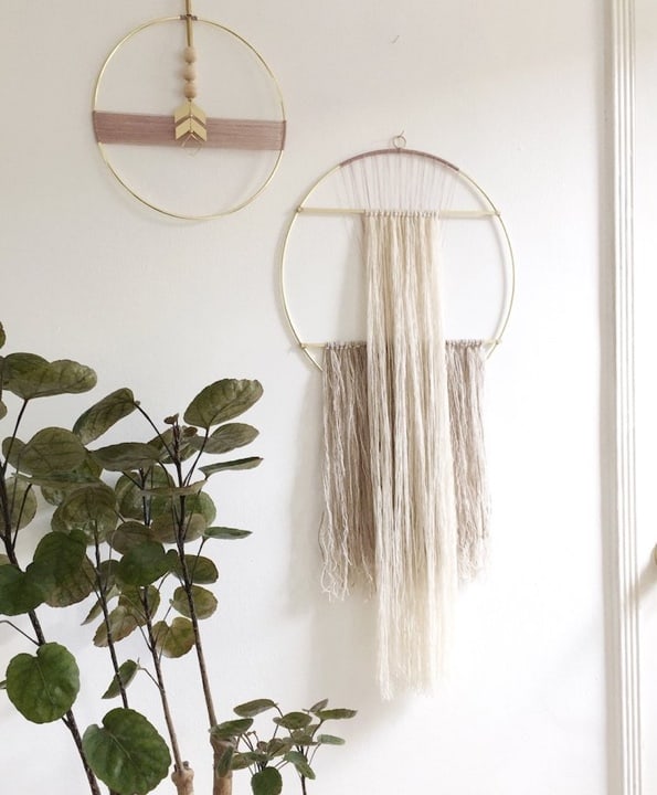
Large doorway wall hanging by Attalie Dexter
[/one_half_last]
Thinking In Three Dimensions
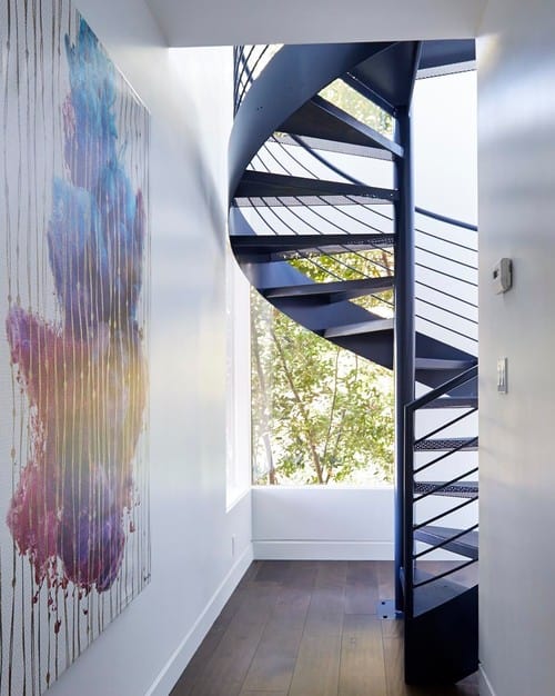
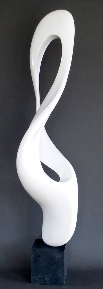 Freestanding sculptures also create a lot of interest and conversation. They’re a great way to liven up a little nook by the foyer stairs. Don Frost is an incredible sculptor who makes surprisingly lightweight pieces of art with fiberglass. I had the pleasure of meeting him and seeing his artwork at the Isabelle Garrucho Gallery located in Greenwich, CT.
Consider the Space and Subject
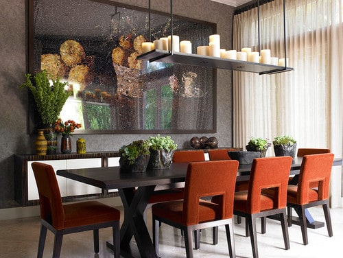
Certain types of art should stick to appropriate settings. Still lives or artwork depicting fruit or food make sense in the kitchen and dining areas. Mirrors always work great in a foyer, especially if it’s a cozy space that doesn’t get much light, like most colonials. Your framed diploma makes more sense in your study or office than above your bed or above your mantel. So try to organize any pieces you already have by subject content. Abstracts and landscapes or non-objective art looks nice in dining rooms — most people don’t want to see nudes, or historic battle scenes while eating their dinner. Family photos are great to hang in hallways or transitioning spaces, when you have a gathering and people make their way through the house they’ll stop and see precious moments. And please please please, keep any “quote art” to a minimum. No more than 1 quote plaque per space, keep any initial sculptures to a minimum, and no wall decals unless it’s in a nursery or kid space. One of my biggest pet peeves as a designer is walking into someone’s home and feel like their walls are saying 15 different sappy phrases about “home” “love” or “family”. It’s overwhelming and feels manufactured and ingenuine. Remember, variety is the spice of life.
Consider the scale
In addition to the empty wallspace dictating the size of art you can fit, you also need to consider the distance you can stand back and see that wall. Putting a huge piece of art along a long narrow hallway will certainly fill the space, but you’ll never be able to appreciate it. Putting a large piece of art at the end of the hallway that can be viewed as you walk towards it, is a-okay. I like to encourage gallery walls of family photos in narrow hallways. Or a series of pieces, it could be photos of the kids, pets, or even a series of pieces with a cohesive theme or color scheme. As you move through the space you can see each one, and it creates a story.
Large pieces of art work well over sofas in large living rooms. But if you’re afraid to commit to a large piece, a grouping of pieces is perfectly fine too. You can always change out the photos in the frames, or swap things out if you get tired of seeing the same thing. I could go into a whole list of tips for creating a gallery wall, but let’s save all that nitty gritty for another day.
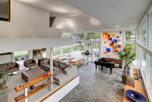
Large scale painting in an expansive space
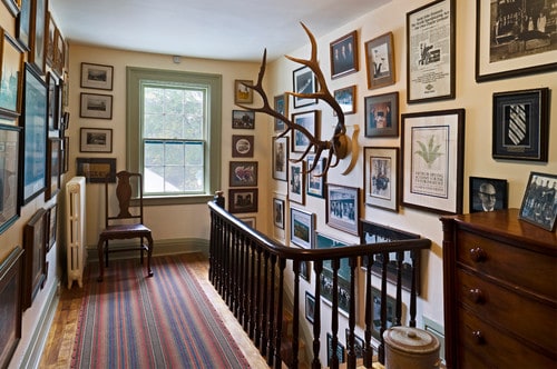
Gallery walls telling a story in a transitory space
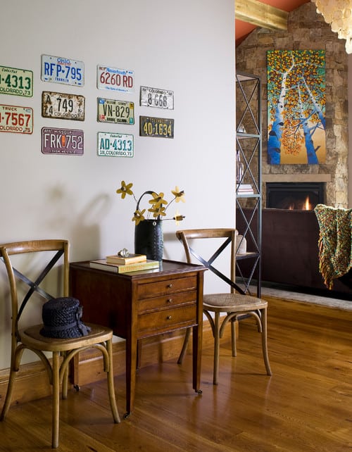
Using a grouping of objects as art
Guidelines for hanging and positioning art
Ok, let’s get the NUMBER ONE rule out there first. The rule of thumb for hanging a piece of art, is that the center of the piece should be 60 inches or 5 feet from the floor. That is the average eye level for most people. Too many times I have walked into a home where the 6’+ husband hung all the art and it’s practically hanging form the ceiling. If you’re doing a grouping of pieces, use this same rule for the center of the overall grouping.
- TIP: When hanging artwork above a piece of furniture like a console or sofa, it should hug the piece, place it 4-6” above, so it doesn’t look like it’s floating away.
- TIP: A single piece of art, or grouping should be about 2/3 of the overall width of the furniture piece beneath it.
- TIP: Hang art with a buddy. It’s a good idea to have someone hold up the piece to make sure it’s a good scale and size before you put a hole in the wall.
Most importantly, make sure you’re using the proper fasteners. Heavy pieces require anchors or cleats to keep them secure. Ask the experts at HomeSquare to help with your art installations to make sure the proper tools are used, and everything is level. Request a free estimate now.
[divider style=”single” border=”small”]

Katie Canfield is the founder and principal designer at Studio KC. Studio KC got its humble start in 2015 when Katie was just 23 years old. While she was freelancing with other interior designers in the NY and CT area she also became a go-to designer for local contractors and trades that needed a designer’s help for their clients whether it be for custom cabinetry drawings or plans for a gut renovation on an entire home.
Katie Canfield’s design aesthetic is eclectic and flexible. She delights in the marriage between old and new- keeping spaces approachable but still matching each client’s unique aesthetic and family narrative. Her passion for design keeps her motivated and constantly on the hunt for new trends and materials. Her broad experience includes an art history background, study at the Accademia Italiana in Florence, a stint with the renowned Manhattan firm Amanda Nisbet Design, as well as collaborations with builders and designers across the tri-state area. She’s seen it all: from gutting prewar Manhattan apartments to new construction in the ‘burbs.


