 Over the next few months we’re going to be doing a blog series on top trends in home décor. In this post we’ll be taking a look at the hottest trends in tile décor, and how to incorporate these styles into your own home! These styles can be used anywhere: mudroom, bathroom, and even the kitchen backsplash.
Cement Tile
Cement tile (or cement-look tile) is HOT right now. This material traditionally is seen in Mediterranean and Tropical design, with bold patterns and color. It’s making a big splash in home décor, adding a sense of exotic whimsy and an infusion of color. The unglazed texture of cement also adds a unique softness unlike most glazed ceramics, porcelains or polished stones. We’re seeing this trend a lot in mudrooms, funky bathrooms, on stair risers and even casual kitchen backsplashes. I personally think this look would be so fun for the backsplash of a fun pool house kitchenette!
Some of my favorite cement tiles:
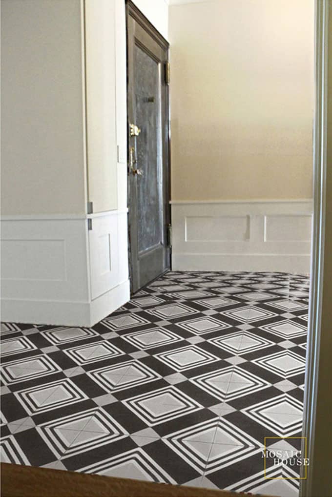
Mosaic House’s Tirol cement tile
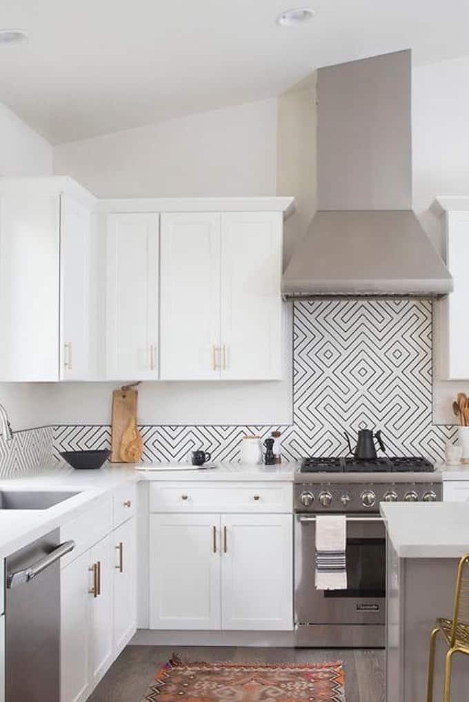
Clé Tile Zenith design
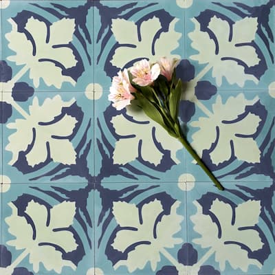
Jardinage tile from Grow House Grow
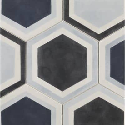
Paccha tile from Ann Sacks
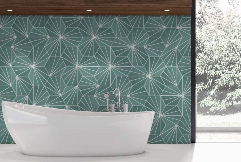
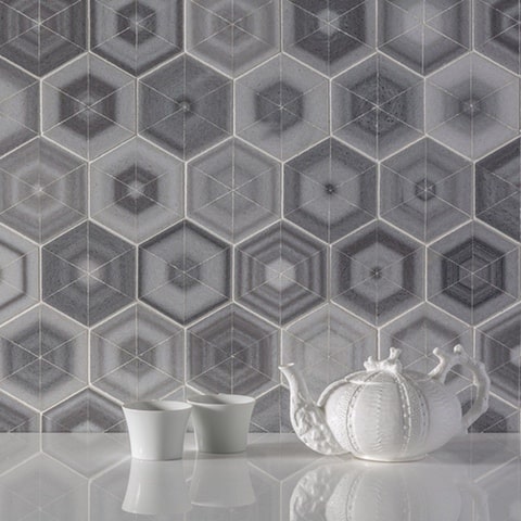
Radar Hexagon from Cle Tile installed in bathroom
Scalloped Tiles
There’s no doubt that scallop patterns can be pretty fabulous. A little bit of fun, a little bit of the unexpected. Scalloped tiles create a sense of fun and whimsy. Handmade tiles that have a non-uniformity in glaze or exact shape are wonderful. They really give the scallop a storybook illustrative look, they pop right off the wall and even look like they’re moving. Play around with the layout of this fun module, mix and match colors. Flip them 180 degrees so the curves are swooping down like a belly, or up like a hill top. These tiles evoke imagery of fish scales or waves of water. They’re a great option for a kids bathroom, a beach house, or property near the water. Landlocked property owners need not worry, these tiles give an offbeat eclectic look anywhere.
Some of my favorites:
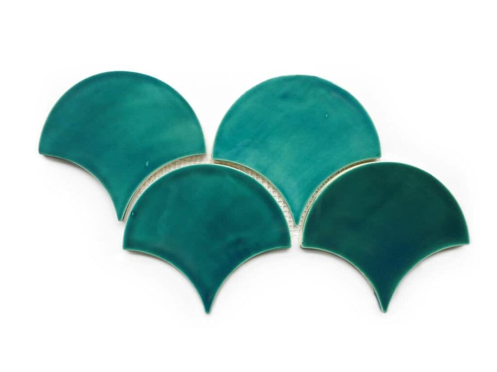
Cle Tile’s Seamist Moroccan Fish Scale Tiles
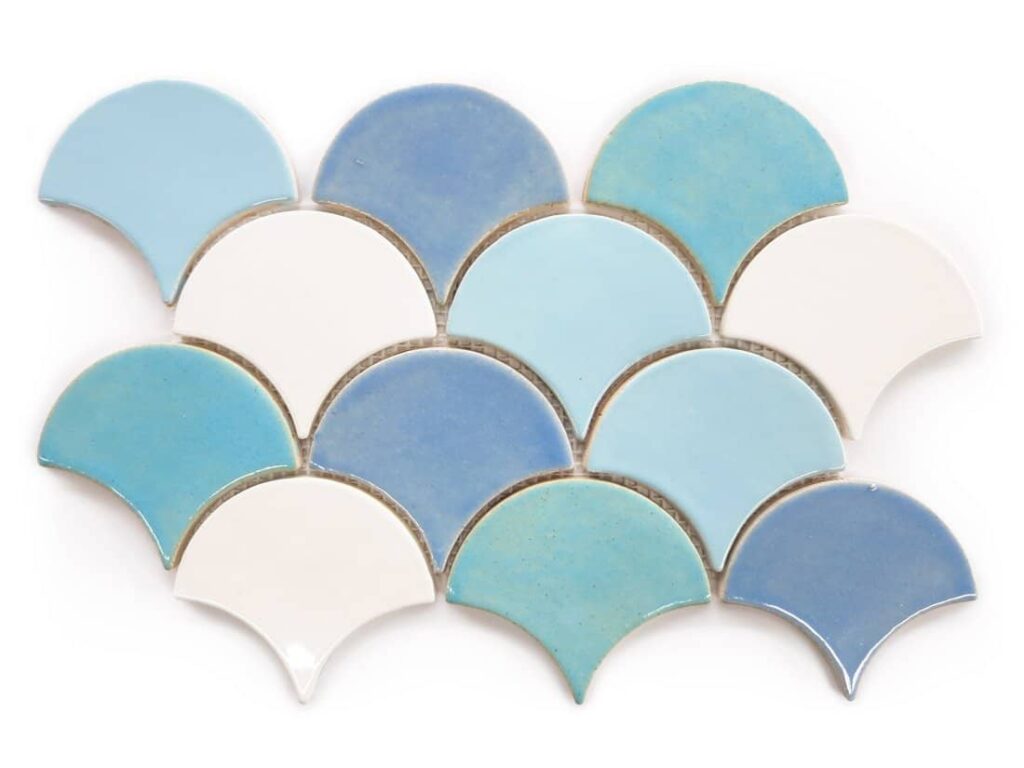
More of Cle Tile’s Fish Scales, in Baby Blue and Deco White
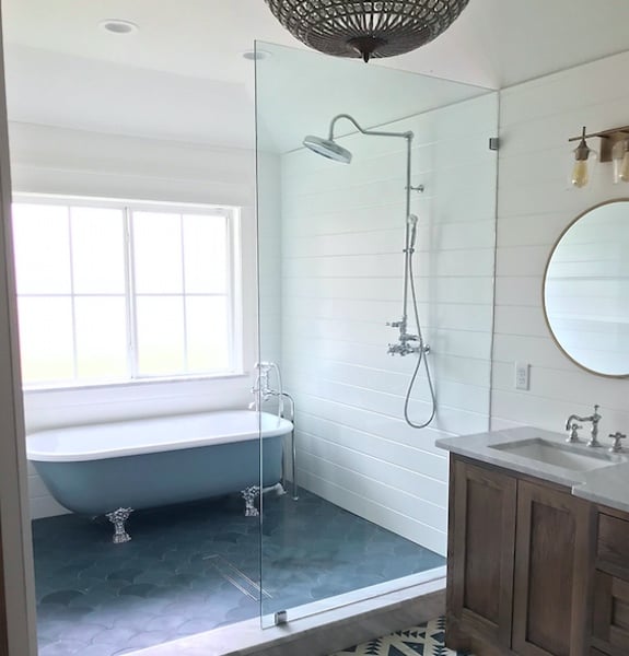
Cle Tile Scalloped Tiles in Federal Blue
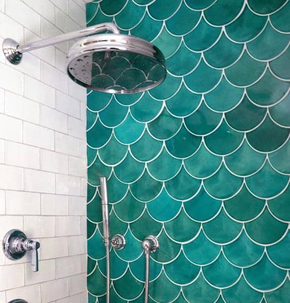
Mercury Mosaics Large Moroccan Fish Scales installed “belly down” with a bright white grout
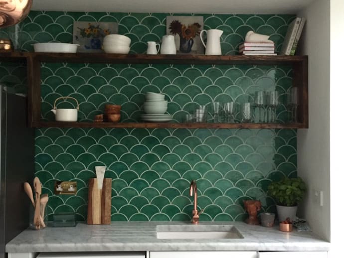
Douglas Watson Studio with a dark green scallop “belly up” on a backsplash
Spice Up Your Subway Tile
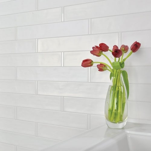
Subway tile is a very timeless look. This brick shape module is never going to go out of style. But we all like to mix things up every once in a while. There are a few different trends happening in subway tile right now. One of which is the handmade look, handmade tiles have a beautiful quality to them. Not two tiles are the same and they give of a nice texture and a bespoke warmth. Similarly the handmade brickwork tile adds even more of a twist, making the tiles look like glazed brick stone. It’s a provincial look that can be traditional, or contemporary. Darker glaze colors like charcoal gray and black can look chic and modern. There’s also lots of trends in different layouts of subway tiles. Larger format tiles like 4×12 are long and lean, compared to a 3×6. We’re seeing lots of fun trends like stacked, herringbone, or even 90 degree herringbone subway tile to add a little oomph to the expected.
My subway favorites:
Some innovative ways to lay classic rectangular subway tile:
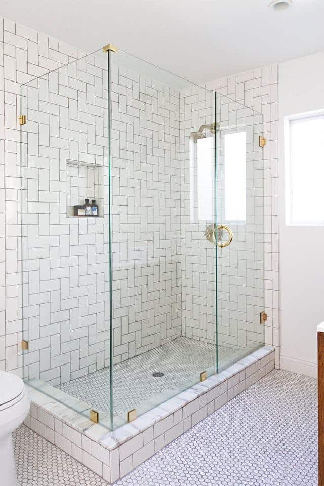
90 Degree Herringbone
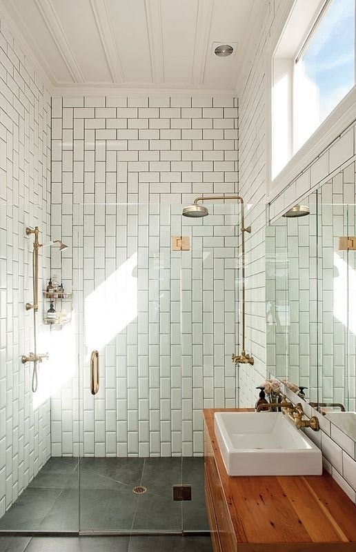
“Mitered” Subway Tile
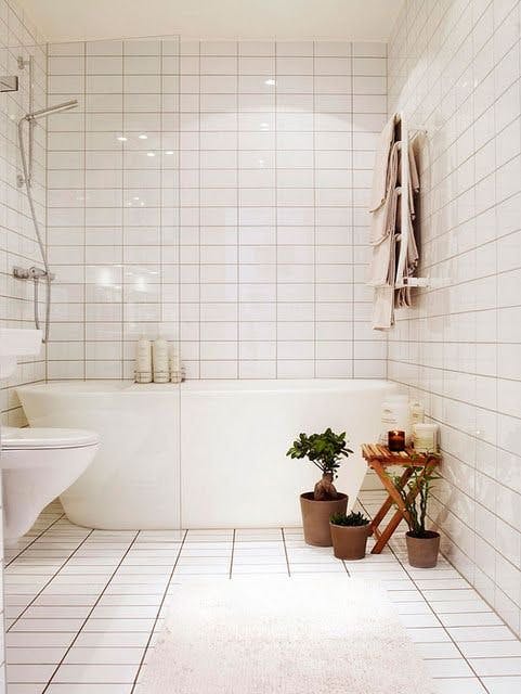
Stacked Subway Tile
Bold Patterns in Stone
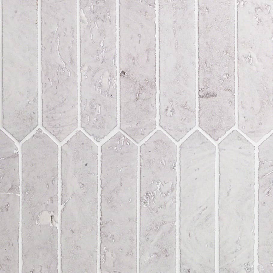
Let’s talk about some serious showstoppers in natural stone. There are some really cool tile products out there using natural stone and laying out the tile in a fun graphic way. Even playing with the stone’s natural veining and color variation to create jaw dropping patterns. Similarly, waterjet mosaics are cut with laser precision to create absolutely elegant patterns that you wouldn’t believe. These waterjet mosaics come with a hefty price tag, so use them sparingly and somewhere where they will be seen, like an accent wall or “rug” in the powder room, or as a focal point over the stove on the kitchen backsplash.
Some favorites:
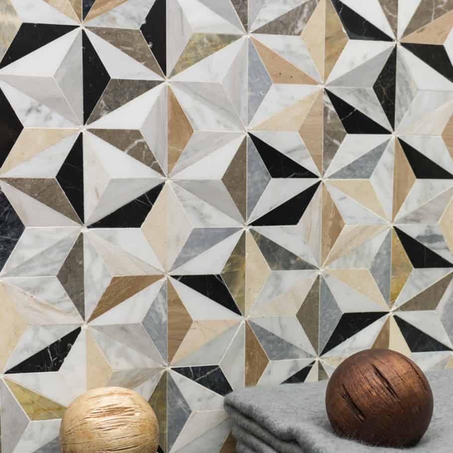
TileBar Phantasm
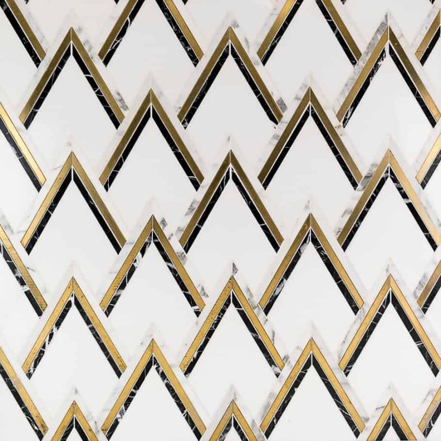
TileBar VZAG Nero & Brass
Akdo Origami Kiki
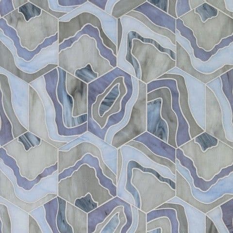
Lauren Harper Agate Lilac
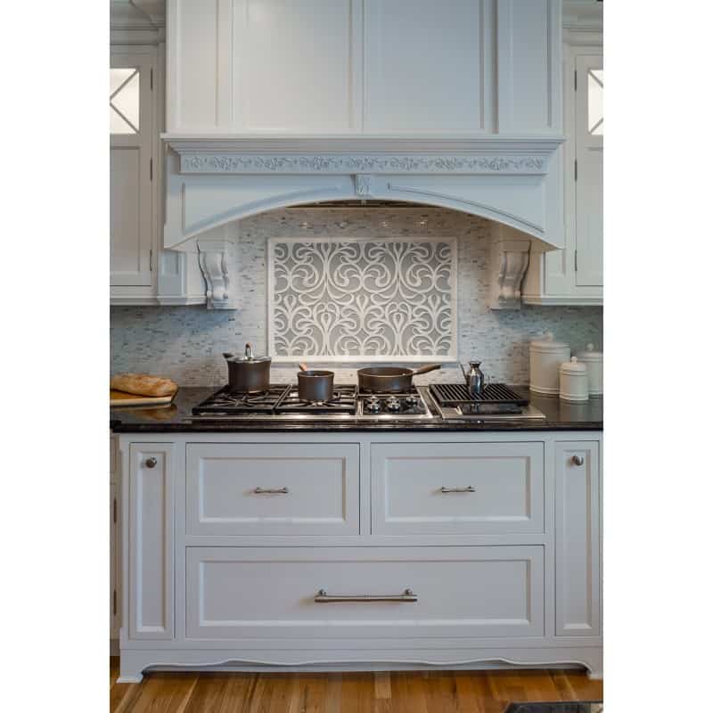
Artistic Tile’s Danse Lucido as a backsplash focal point
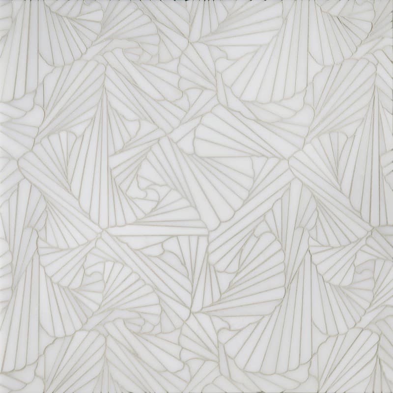
Artistic Tile’s Origami Alta
Need help with a tile installation or replacement for your kitchen or bath? Give us a call!

Katie Canfield is the founder and principal designer at Studio KC. Studio KC got its humble start in 2015 when Katie was just 23 years old. While she was freelancing with other interior designers in the NY and CT area she also became a go-to designer for local contractors and trades that needed a designer’s help for their clients whether it be for custom cabinetry drawings or plans for a gut renovation on an entire home.
Katie Canfield’s design aesthetic is eclectic and flexible. She delights in the marriage between old and new- keeping spaces approachable but still matching each client’s unique aesthetic and family narrative. Her passion for design keeps her motivated and constantly on the hunt for new trends and materials. Her broad experience includes an art history background, study at the Accademia Italiana in Florence, a stint with the renowned Manhattan firm Amanda Nisbet Design, as well as collaborations with builders and designers across the tri-state area. She’s seen it all: from gutting prewar Manhattan apartments to new construction in the ‘burbs.


1 Comment