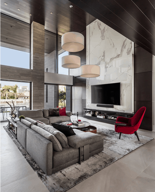
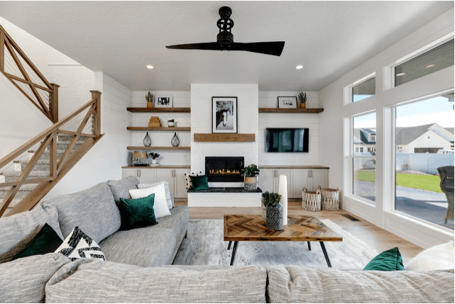
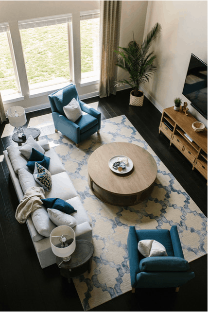
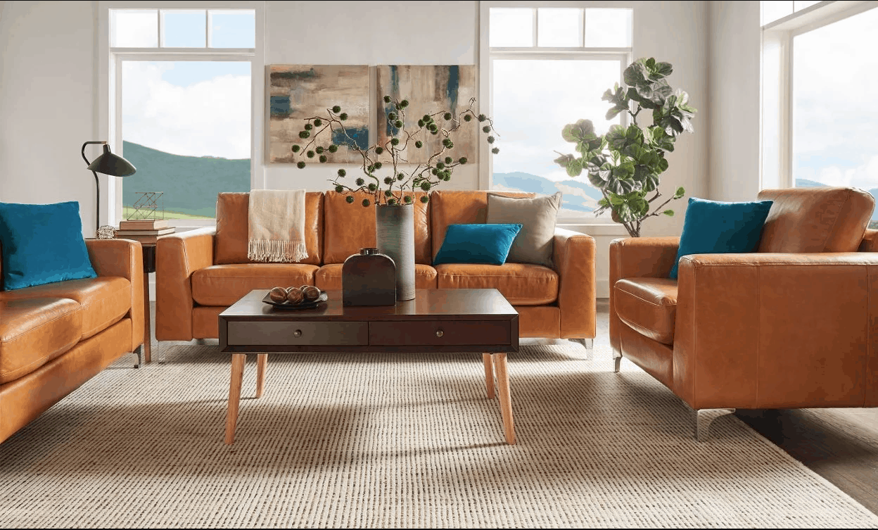
2020 is upon us! Who would have thought we’d finally be living in the future! If you’re ready for a change with your décor for the new decade, here are 5 rookie mistakes that I know I and other designers see all the time. Read more to make sure your décor has a “glow up”!
1. Rugs that are too small
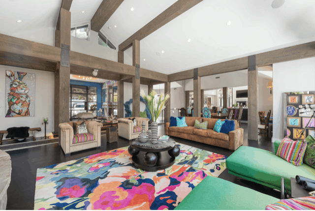
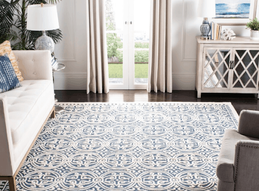
This is often one of the first mistakes I notice in a room. People often feel the urge to leave as much of their wood floors exposed (often because they’ve just replaced them, or spent lots of money refinishing them!). What they don’t realize, is a smaller rug actually makes your room FEEL smaller. A larger more expansive rug is going to visually draw your eye out and around the space, making it feel bigger and more luxurious. This is often a problem I see among younger home owners who are holding on to things they have because they’re in good condition or recently purchased. Getting a properly sized rug is a quick and easy fix. There are so many rug manufacturers now making power loomed rugs from polyester, you can get a large fashionable rug at very low costs. To learn more tips on choosing rugs see our previous post here.
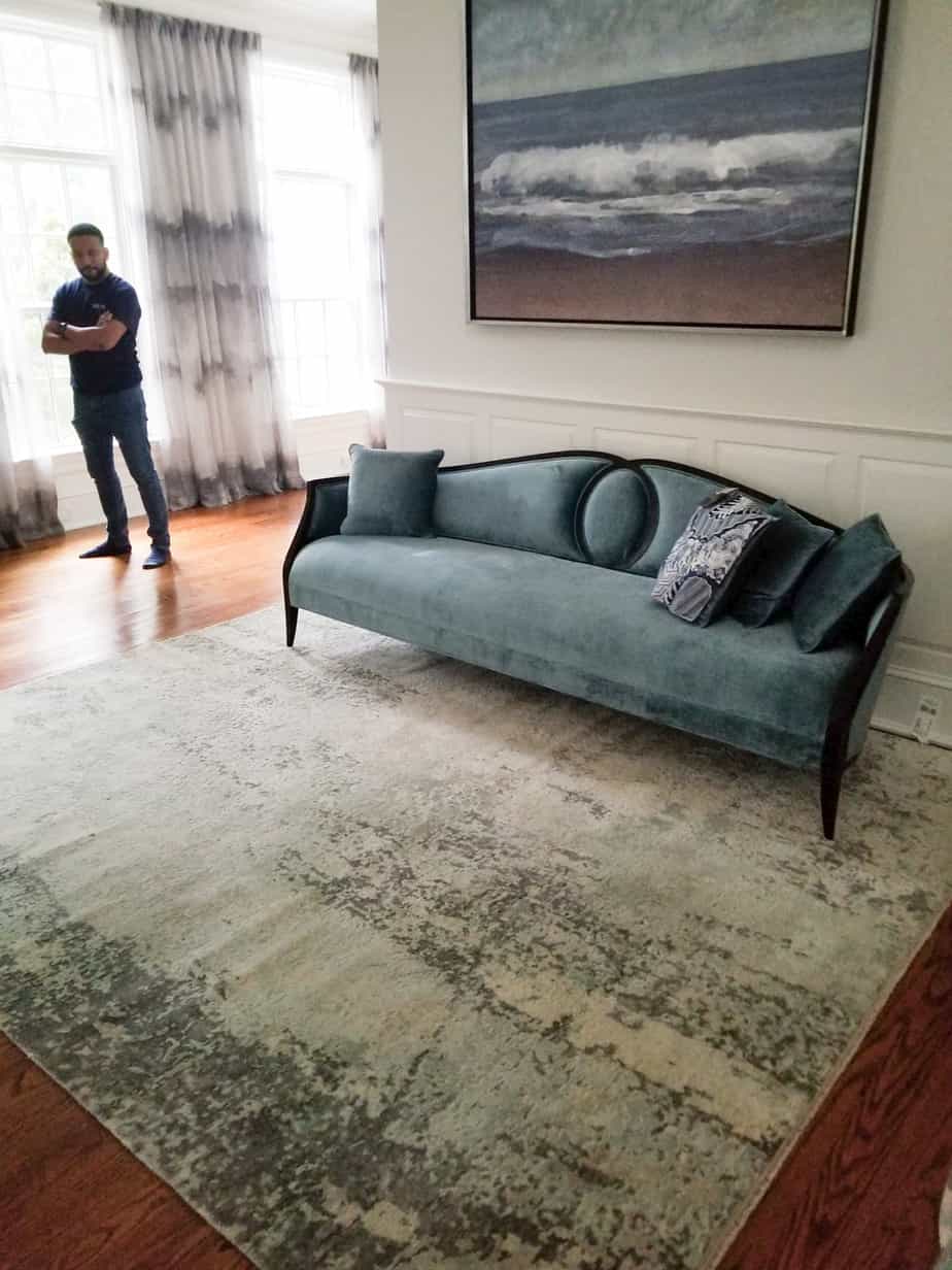
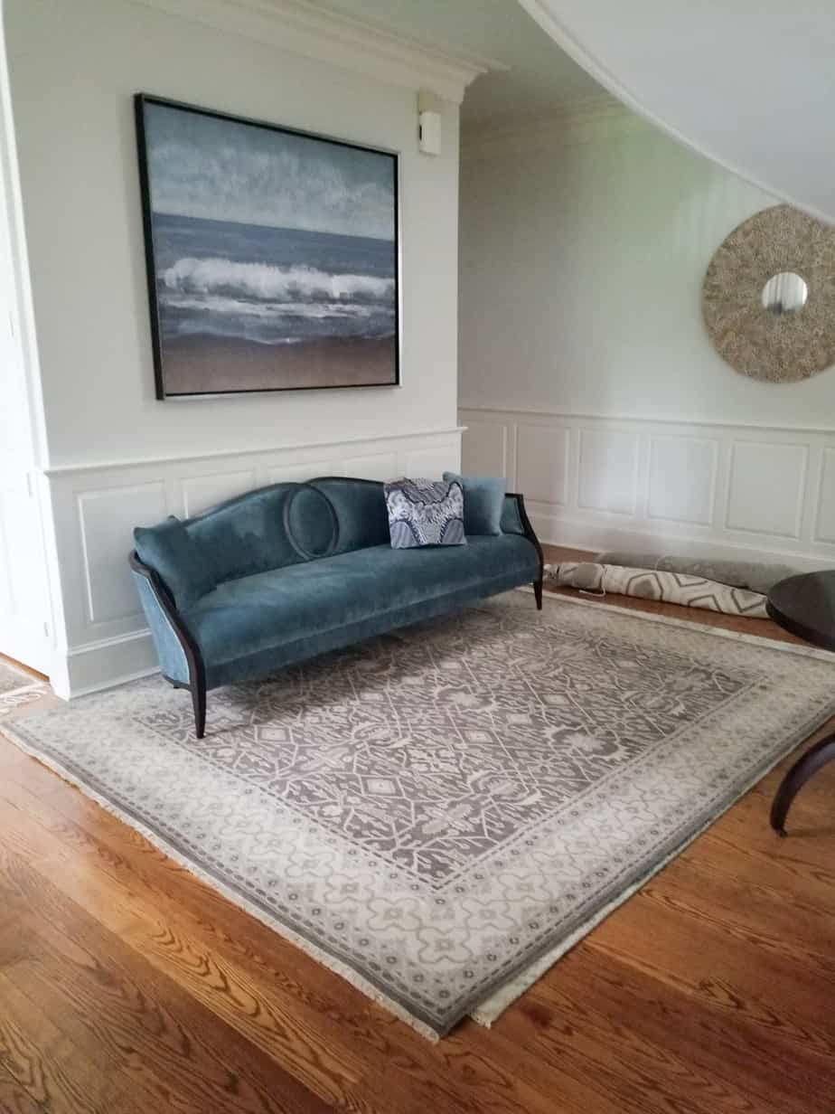
ROOKIE: Rugs that are too small – furniture shouldn’t be surrounding a rug without touching it or look like it’s just “tip toeing” on it. A rugs purpose is for grounding a space and it should feel substantial.
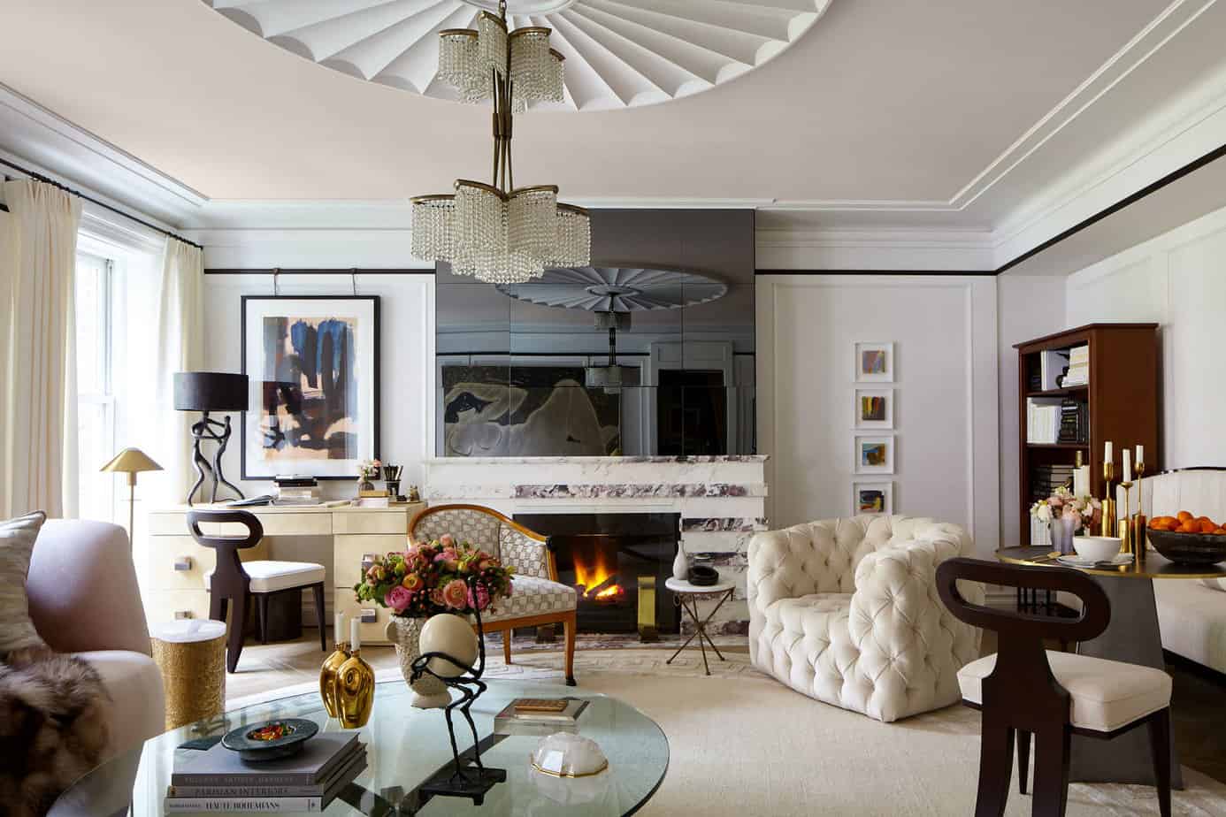
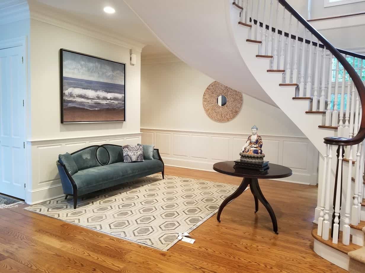
PRO: Rugs that are just right – they fit the space and everything feels grounded.
2. Over-matching
I think rookies often get concerned about all sorts of “rules” that need to be followed. They become too concerned about things not working together so they run in the complete opposite direction and end up with a space that is “matchy matchy”. The truth is, there is no book of commandments for interior decorating. At the end of the day what’s most important is function and layout, comfort, and being surrounded by things you love to look at.
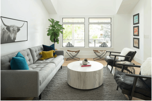
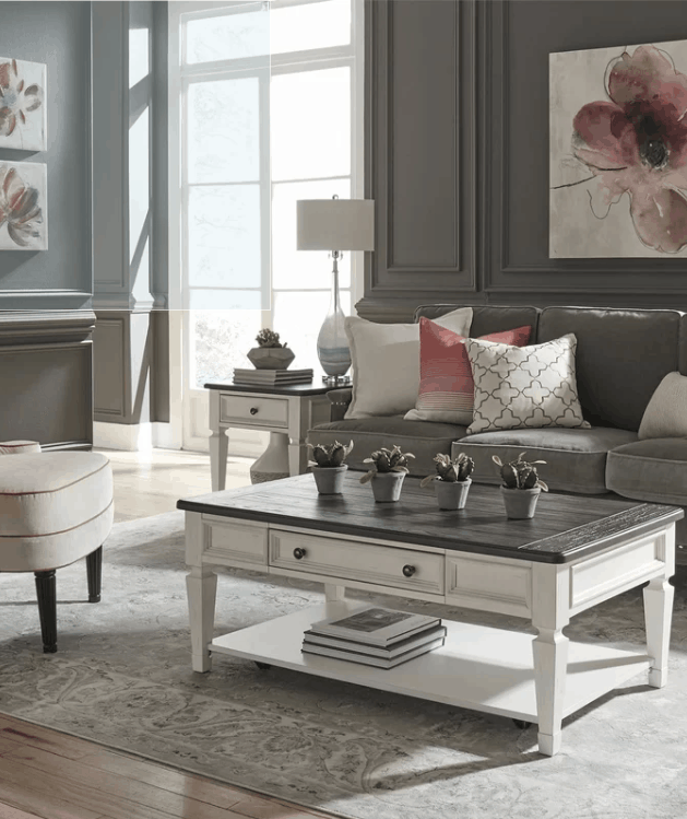
Try to resist the urge to buy “sets” of furniture. A pair of matching end tables, or lamps for the sake of symmetry is fine, but don’t be afraid to add new elements and new colors. Mix wood tones with metal finishes or play with light and dark.
If you need a rule to stick by, in order to help you feel like you’re doing something right, stick to the rule of threes. Choose a new colour and find some pillows, a rug pattern, and a decorative tray that all use it. If you use something 3 times, it feels more intentional and foundational. Force less, and let your different pieces have a conversation with each other, rather than all saying the same thing.
ROOKIE: Steer clear of “3-piece matching sets” Let each piece of furniture be unique and tell it’s own story.
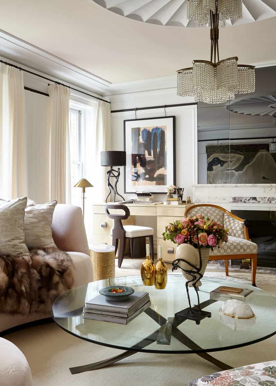
PRO: Allow things to feel collected. Let pieces “coordinate” and not “match”.
3. Poorly hung window treatments
This is another quick and easy fix for a very common mistake. Drapes should be hung ABOVE the window frame, not at it. This adds drama and height to the space. There are all sorts of gadgets and pieces of hardware that will let you clip cheap window hardware onto the frame of the window and allow it to hang. Using the cheap white metal rods from the local department store and sliding them into a rod pocket (this is when the top hem is left open on the sides of drapery panels to slip a rod into) is a sure way to make your space like a dorm room.
You don’t need to spend a lot of money to get decent looking drapery hardware in a nice metal finish. You can even buy drapery rings with clips, and clip them on to “ready made” panels at the store – you don’t need to pay for custom window treatments. Many drapery panels at the store come in an 84” length, which for many cases will be just at the top of your window. Opt to go up one size longer than you think you need, and if necessary, take them to a local dry cleaner to be hemmed. Depending on the height of your ceilings you may want to hang your drapes as high as you possibly can, or about half the distance between your window casing and the ceiling/crown molding. If you have very wide windows, buy 2 panels for either side and have a seamstress or local dry cleaner sew them together to make your panel double wide. Think about drapes as a way to add texture, color and drama to your space.
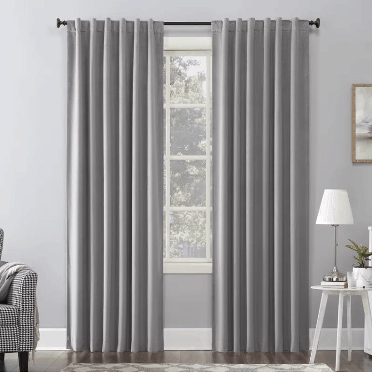
ROOKIE: These drapes are hung too low, and the rod is too narrow, the drapes are blocking all of the natural light and view! What other rookie mistakes do you see here? 😉
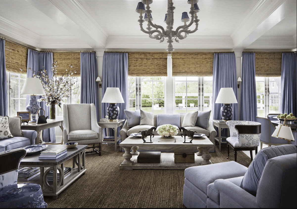
PRO: Drapes hung high and tight to the ceiling, layered with shades to allow the user to block light or open up. They add drama to the space – imagine what this space would look like without them!
4. Lacking scale
Having appropriately sized furniture for your space is vital to allowing for good flow of traffic in and an out of the space. Also, very importantly, make sure it will fit through the door! If you’re decorating and buying furniture on your own, tape it out on the floor. Or, take two tape measures and lay them both down, one for the length, the other for the width of each piece. I often have 2-3 tape measures in my bag for house calls just for this purpose! While I always plan things out to scale on paper, most of my clients have trouble understanding the size of pieces until we map in out in the space. And in today’s cyber based shopping, many people order furniture online without ever having seen it, so make sure you check dimensions thoroughly.
If you’re in an apartment, opt for a loveseat, or apartment sofa, smaller scaled arm chairs, smaller drink tables and a smaller coffee table. Before pulling the trigger on a massive sectional for your great room, check the dimensions and layout of each piece thoroughly, and ask for help if you are unsure on left/right facing pieces. When selecting side tables, compare the height of the table with the arm height of the chair, making sure they are roughly the same or no more than an inch or two shorter. If necessary, sit in a chair and use a tape measure to represent the arm height and another to represent the height of the table – imagine placing a drink on the table and make sure it is a comfortable height!
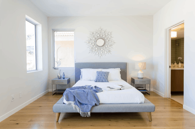
ROOKIE: Notice the huge gap between beside tables and the bed, and the walls. I imagine I’d roll off the bed trying to reach for a glass of water!
ROOKIE: A teeny rug with a big comfortable bed, and over-sized chairs sharing an ottoman that blocks your pathway to the bed.
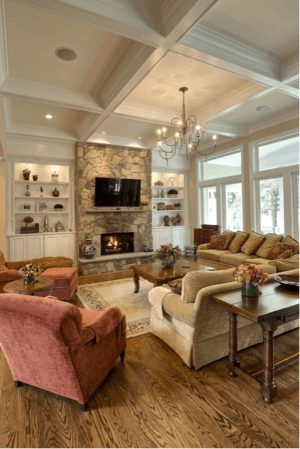
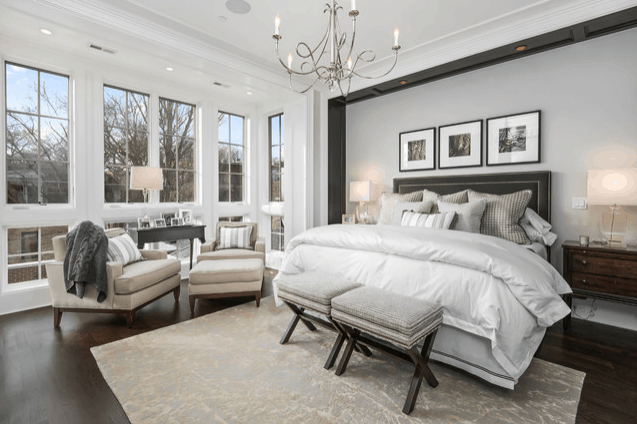
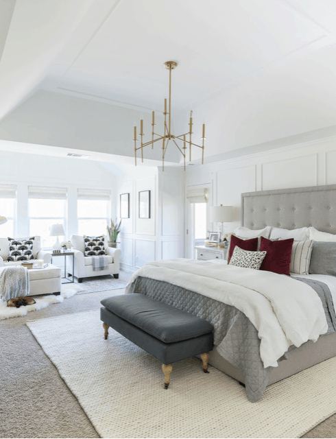
PRO: Furniture appropriately scaled for the amount of space. Plenty of room to navigate and get around, but the pieces still feel weighty and substantial.
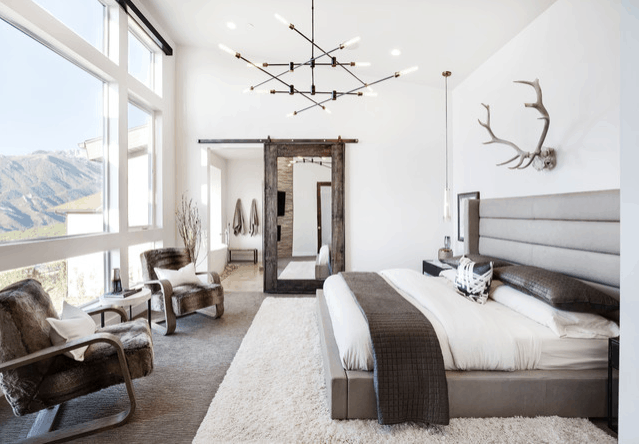
PRO: Think of your space like a cityscape, there should be highs and lows, big and small. Allowing things to be bigger and smaller to one another allows for proportion and harmony.
5. Thinking Everything Needs to Get Done at Once!
I get it, you just put down an offer on a house and now you need to fill it with furniture, art, window treatments, paint/wallpapers and accessories immediately -right? Feeling the urge to just pull the trigger on everything often leads to rookie mistake #2 – over matching. You don’t want your space to look like a furniture showroom. Allowing yourself time to slow down and make decisions as more things come into the space can be helpful to visualize the end result – not to mention it allows your bank account to replenish as you go! Focus on the big things first – large pieces, beds, sofas, dining tables, etc. Find a color scheme that you gravitate towards, knowing that you can always add something else in later. Once your big pieces are in, or while they are on order, think about ancillary furniture – side tables, lamps, etc. I tend to layer in window treatments towards the end with clients.
My clients in this project weren’t sure of what rug size or style they wanted to add into their foyer space. Much of it was decorated with pieces they had bought all at once during their move in. We selected a sofa with a dramatic fabric to add some color, once the sofa arrived we went to a local carpet showroom to bring in a few different styles to allow them to compare together in the space with all the other pieces, and see how the sizing felt for them.
This isn’t to say not to have a plan, or an idea of what you want for everything in the beginning, but I think it’s important to allow things to evolve. Especially if you’re moving into a new space, it’s important to let yourself see how you and your family actually use the space before you’re locked in. Maybe you would have preferred to have a desk where you placed a bookcase, maybe you’d have like some end tables with storage, versus the sculptural one you fell in love with at the showroom. Allow yourself to contemplate and think about things as you start to fill in the space more and more. Don’t rush out to buy a bunch of stock artwork just to have something on your walls and be done, you never know what you may come across in your travels that will be the perfect fit!
Katie Canfield is the founder and principal designer at Studio KC. Studio KC got its humble start in 2015 when Katie was just 23 years old. While she was freelancing with other interior designers in the NY and CT area she also became a go-to designer for local contractors and trades that needed a designer’s help for their clients whether it be for custom cabinetry drawings or plans for a gut renovation on an entire home.
Katie Canfield’s design aesthetic is eclectic and flexible. She delights in the marriage between old and new- keeping spaces approachable but still matching each client’s unique aesthetic and family narrative. Her passion for design keeps her motivated and constantly on the hunt for new trends and materials. Her broad experience includes an art history background, study at the Accademia Italiana in Florence, a stint with the renowned Manhattan firm Amanda Nisbet Design, as well as collaborations with builders and designers across the tri-state area. She’s seen it all: from gutting prewar Manhattan apartments to new construction in the ‘burbs.

