by guest author Katie Canfield
The weather is finally brightening up, and you might be noticing your walls could be looking a little drab. Painting can be a great way to quickly rejuvenate a space. Selecting paint colors can be a serious struggle for lots of homeowners. Way too often I hear about the regret from clients from choosing the wrong color and hesitation to try again. We put together this guide on color psychology to help you find the right color for your atmosphere, and have some of our favorite paint colors to go with!
TIP! Before painting you should ALWAYS do a sample. Either with actual paint, or order color sheets from the manufacturer. You can order those from Benjamin Moore here.
Red
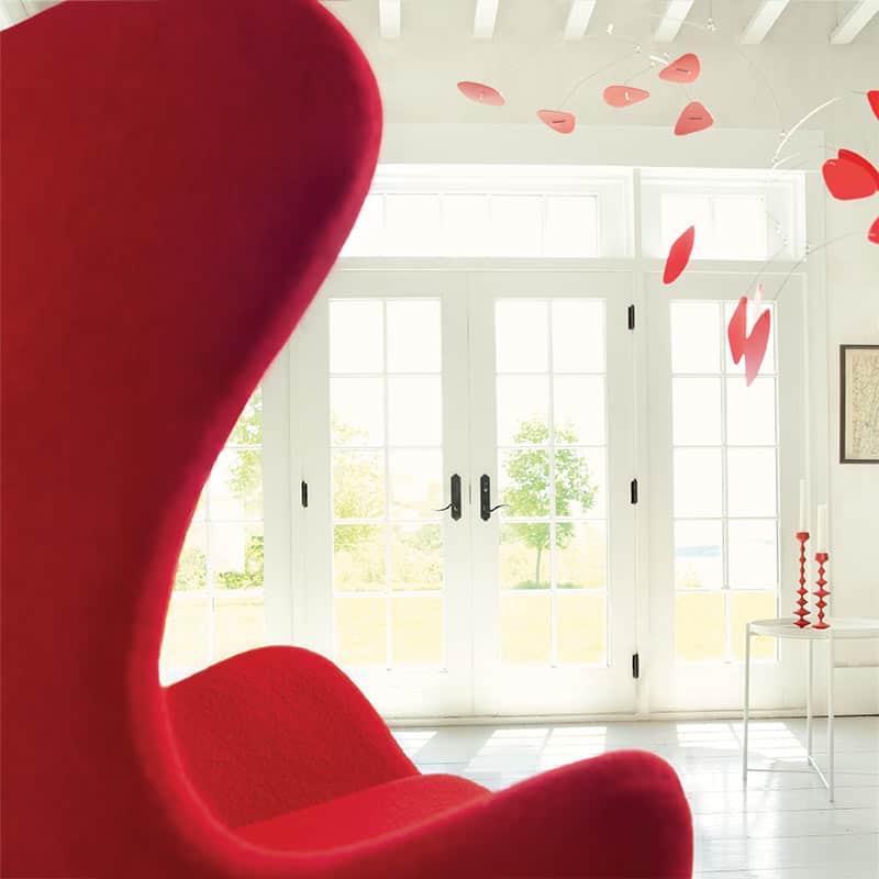
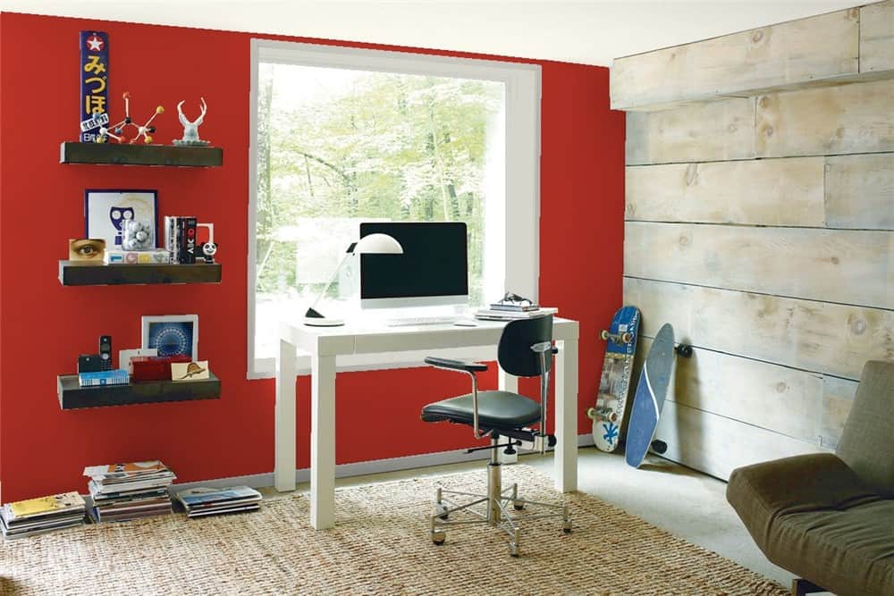
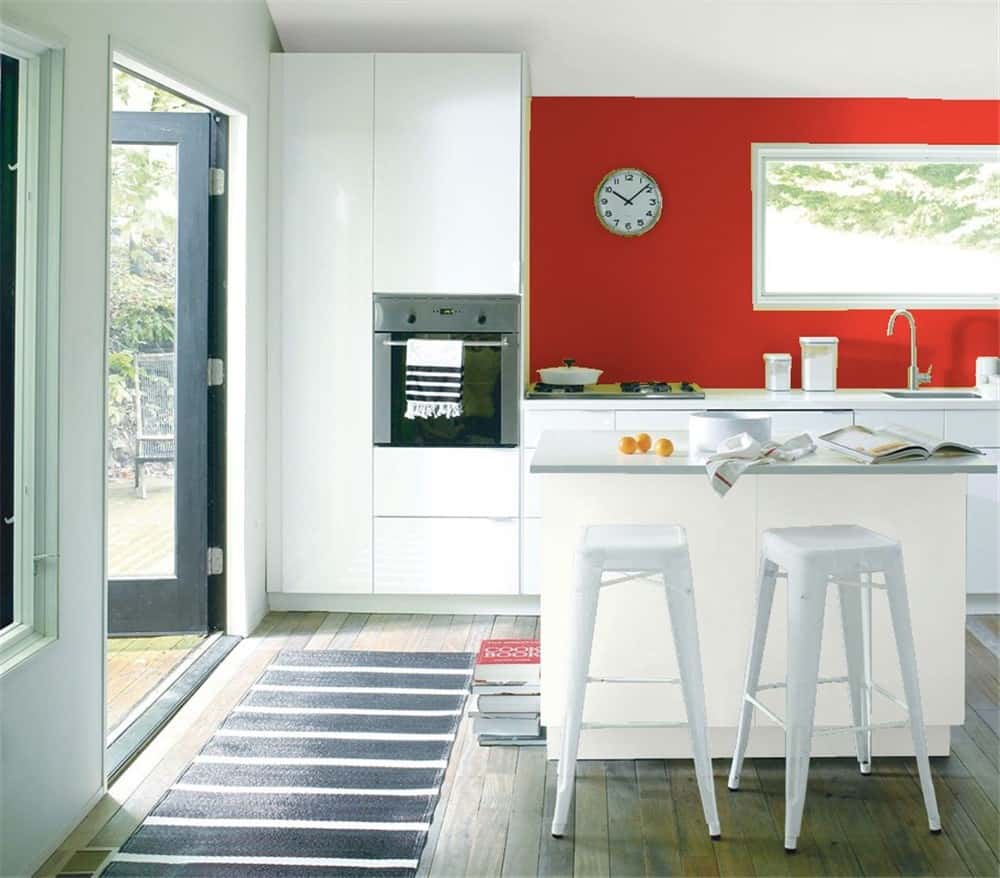
Red is a very vibrant and energetic color. If you want to signify that “the party is here” this might be the color for you! A true primary red is very bold, and when in high contrast with other colors in the room it could literally give a vibrating effect when you look at it. Red should be used sparingly in the home. Typically red is most often seen in the dining room. Be sure the room gets plenty of light to keep things from getting overwhelming. Because red is such an energetic color it could literally make people feel like they need to get in and out (consider red being used in convenience and other quick meal joints, where they want people in and out). Red paints I love:
Caliente AF-290 – Benjamin Moore Color of the year
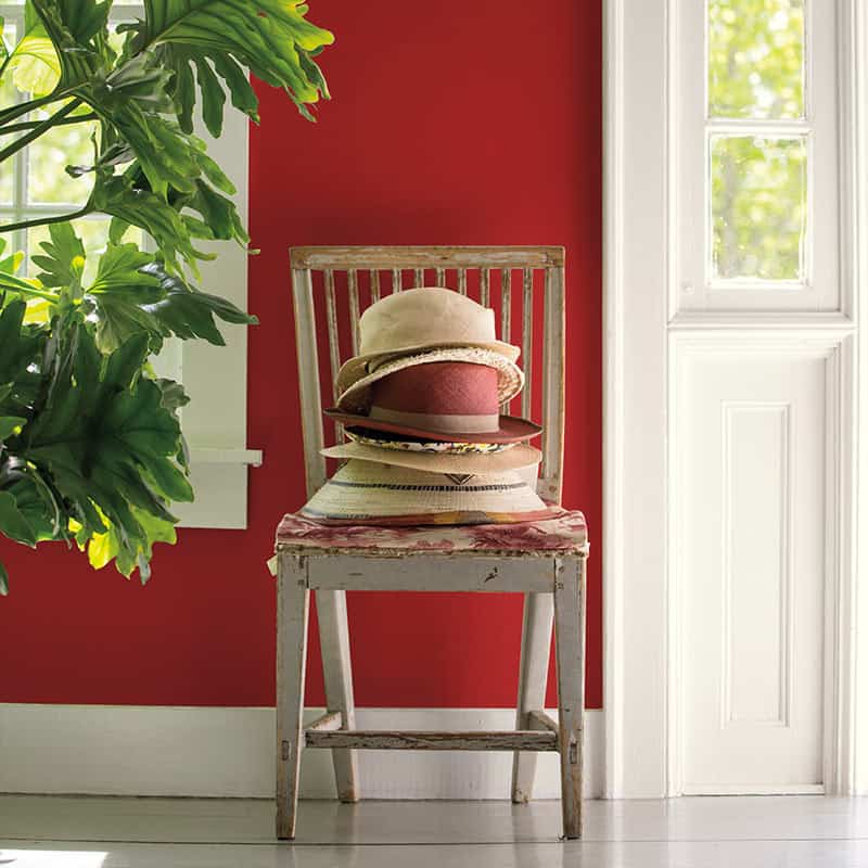
Million Dollar Red 2003-10 – Benjamin Moore
Get a free estimate for painting.
Orange
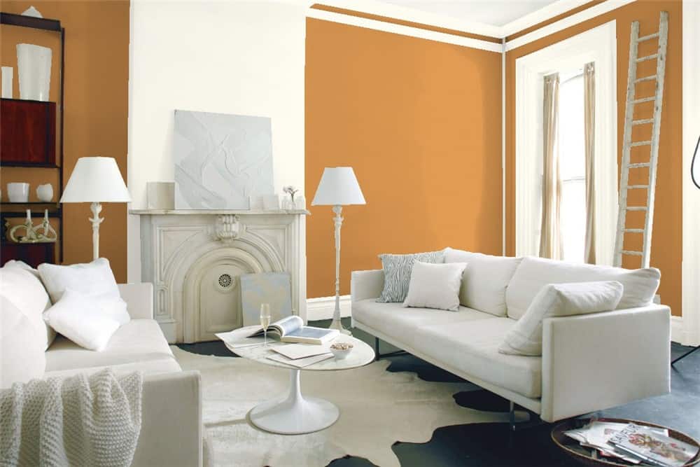
Orange is like red’s little brother. It shares a lot of similar properties, it can be bright and bold and energetic, sometimes people think this is a safer option than going as bold as red. Orange can seem less aggressive and more playful. The color orange stimulates appetite so it can be great in a dining space as well. It’s also a great color for kid’s rooms or play areas. Have fun with orange, go bold, or earthy. Think of how many gorgeous spices come in orange and reds.
Turmeric 2160-20 – Benjamin Moore
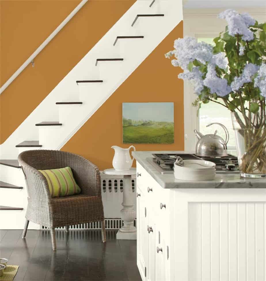
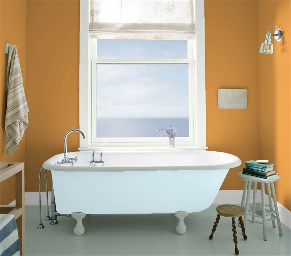
Delightful Golden 2158-30 – Benjamin Moore
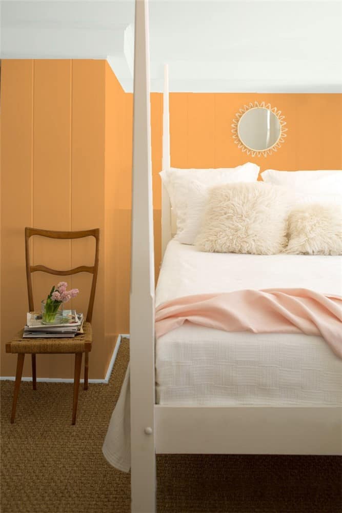
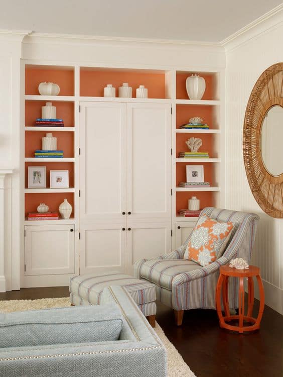
Don’t think you can handle some of these bold colors on your walls? Try painting just the backs of shelves or a pair of side tables for a fun burst of color! Or go wild and keep the walls and furniture light and neutral and then go bold high gloss on the ceiling for a dramatic statement. We can help; let us know if you’d like a free estimate.
.
Yellow
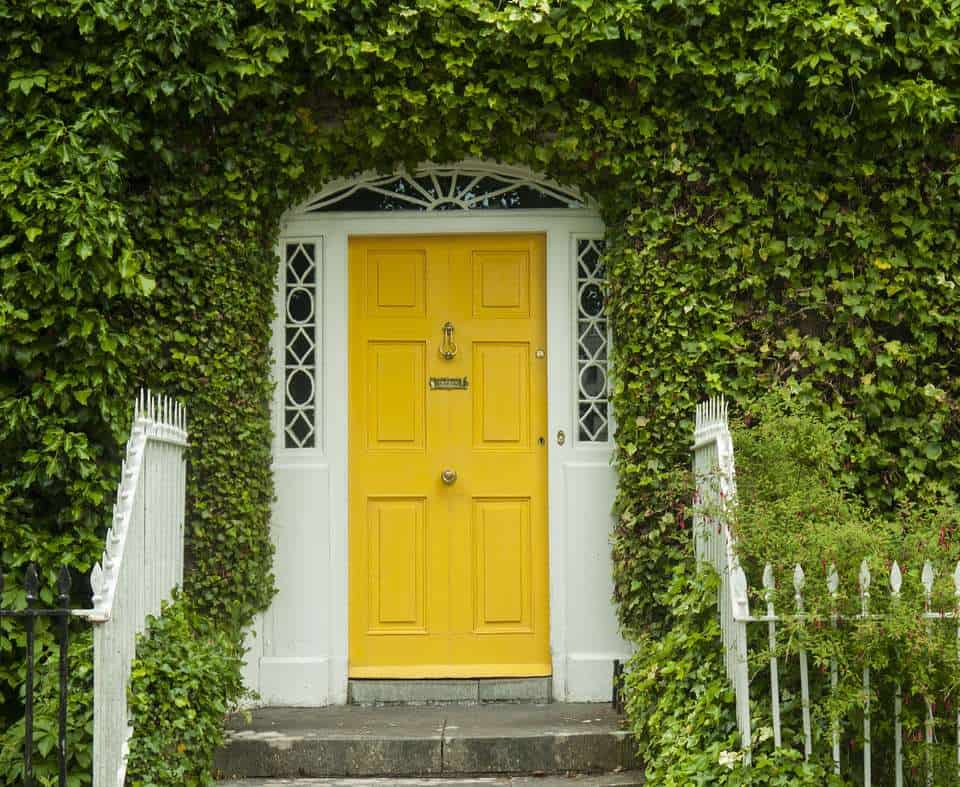
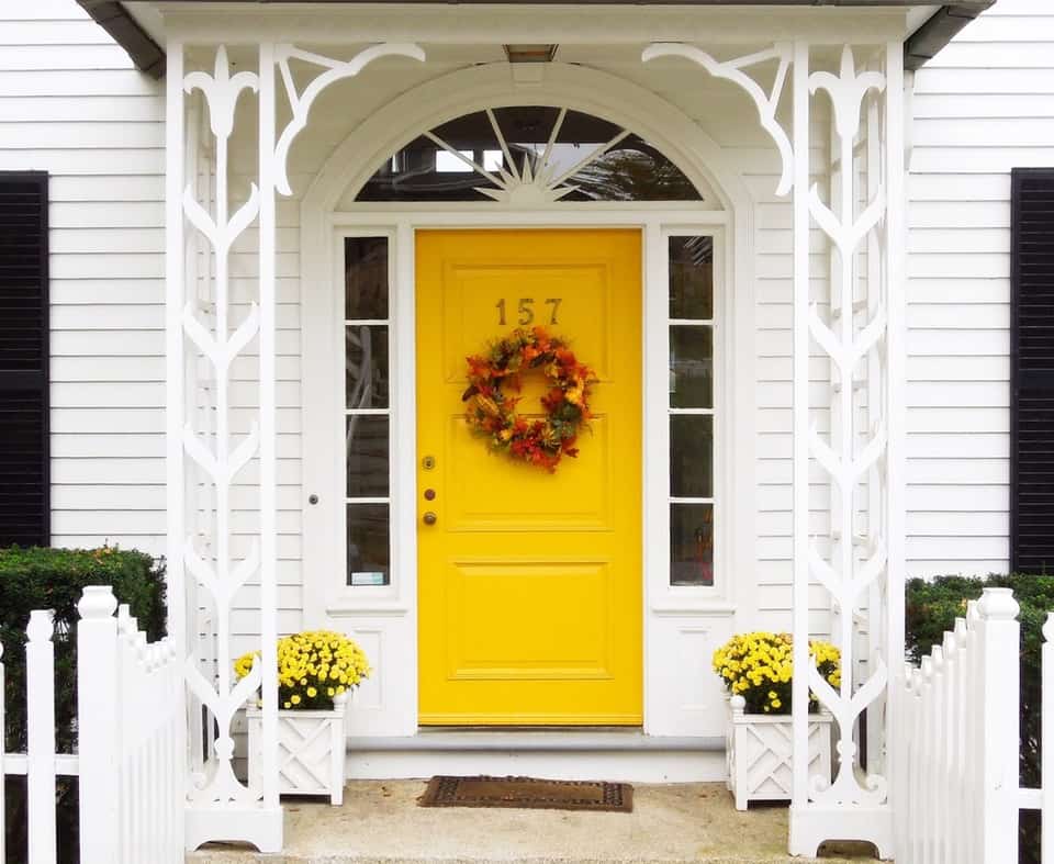
I’m not going to lie, yellow always has and always will be my favorite color. I have always been attracted to it. It’s sunny and friendly, it can be shy, demure and buttery, it can be sophisticated, decadent and rich. Seriously, I love yellow. Yellow has also been shown to stimulate creativity and promote intelligence. It’s a great color for kids rooms, or any social hub. Think lemony yellows in the kitchen, rich mustards in the study. Keep yellow out of bathrooms and the powder room, to avoid the color affecting how your skin tone looks in the mirror. But oh boy does it sure look friendly as a color for your front door!

Yellow paint colors:
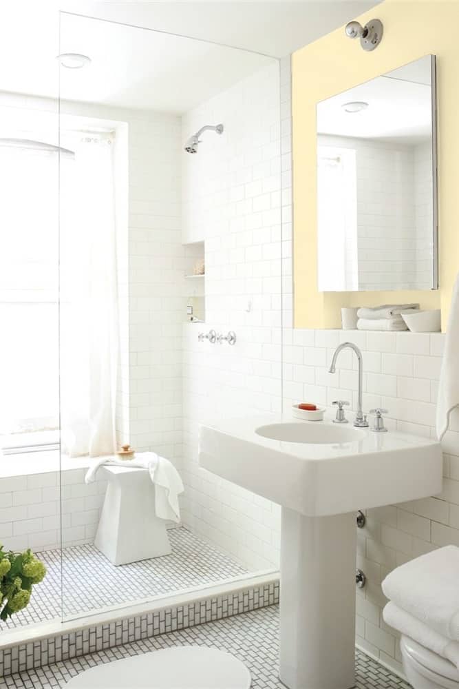
This bathroom accent wall is painted with Lemon Souffle 331 by Benjamin Moore.
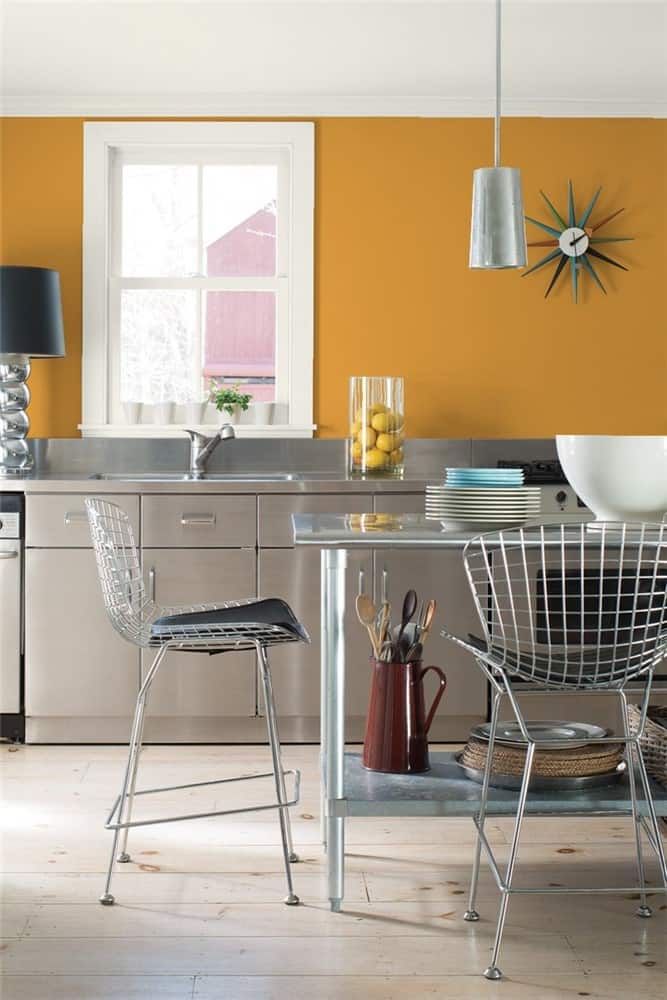
Stainless steel kitchen is set off with Spicy Mustard 2154-20 by Benjamin Moore
Green
Green symbolically represents a lot of things. Growth, money, success, nature. With respect to our natural response, green is a calming and tranquil color. It requires the least amount of work for our eyes to actually read the color, so unlike our bold reds and oranges, this color lets our body relax when we see it. It can evoke the feelings of nature, and be a very fun color without being overtiring to look at. It can be bright or earthy. It’s a great color to use in an office, den or study. Somewhere you’d like to curl up and relax. Consider mixing green and neutrals, and don’t be afraid to go bold with your woodwork!
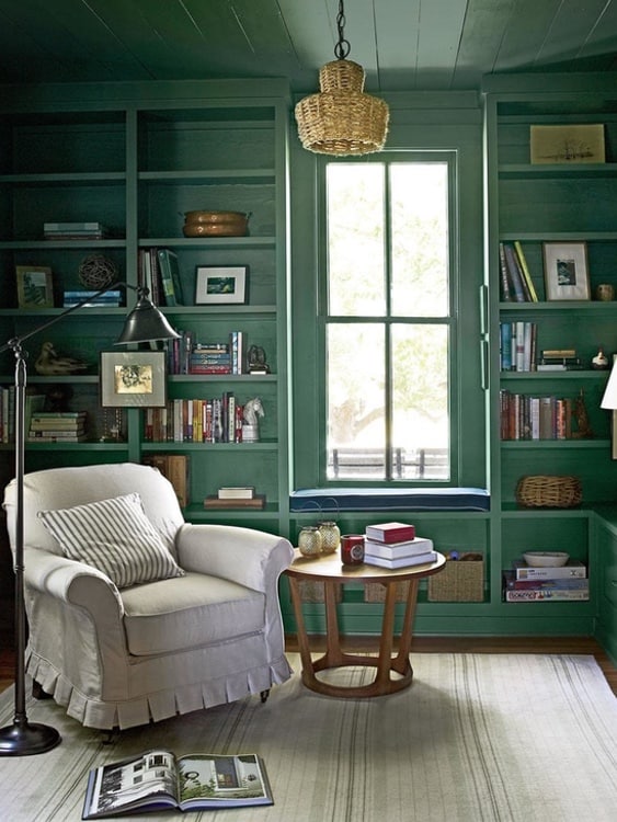
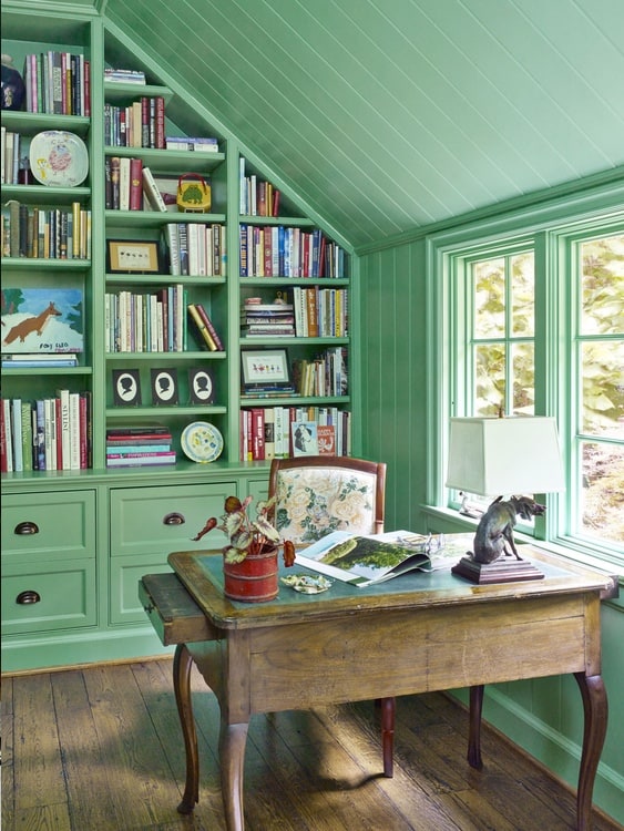
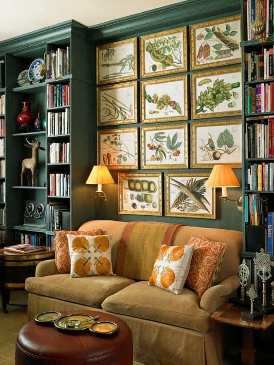
Green paint colors:
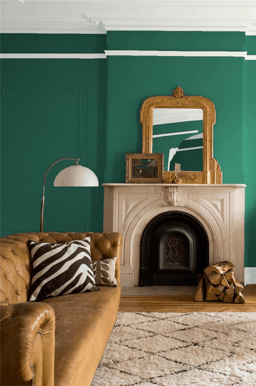
Fiddlehead Green 2041-20, by Benjamin Moore
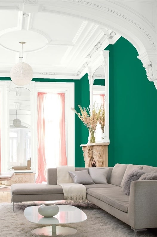
Ming Jade 2043-20, by Benjamin Moore
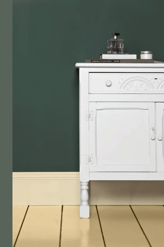
Green Smoke 47, by Farrow and Ball
Blue
Blue has basically become a neutral color at this point. It is non-offensive, generally well regarded and easy to work with. When I meet with new clients and we talk about what colors they like, blue is always a go to. While blue is personable and well-liked, it doesn’t need to be boring. Deep navy hues can be formal and regal, turquoise is fun and fresh and coastal, icy blues can be sleek, contemporary and sophisticated. Blue is tranquil and relaxing, it works almost anywhere in the home. Bedrooms, bathrooms, living rooms. Use sparingly in dining rooms and kitchens because blue can suppress your appetite. However, blue has been making a lot of appearances in kitchen backsplashes and as a fun accent on the island cabinetry.
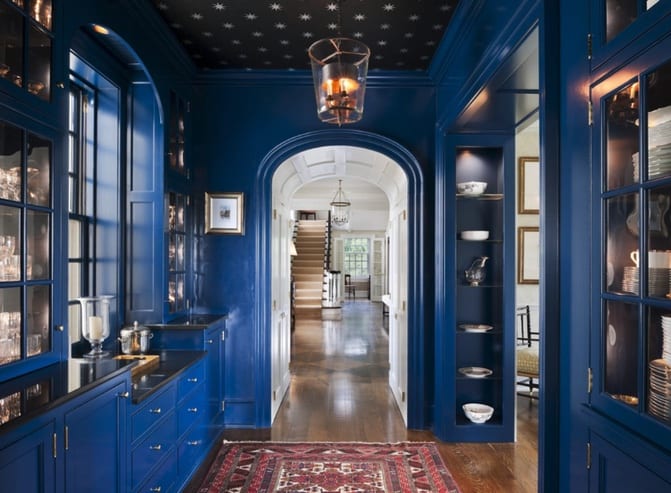
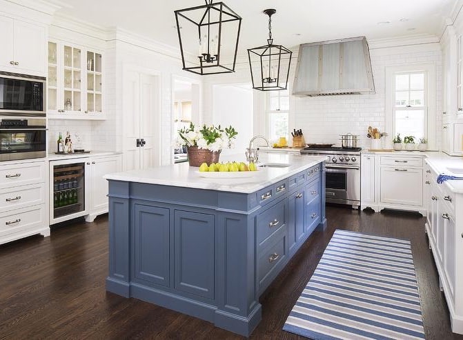
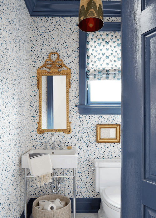
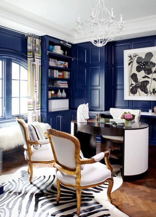
For a fun update, consider painting all the doors in a corridor a sophisticated neutral, it could be navy, gray or even black. Paint only the side facing the hallway. You could have them all blend in with the walls, or make them pop by keeping the hallways walls and trim white.
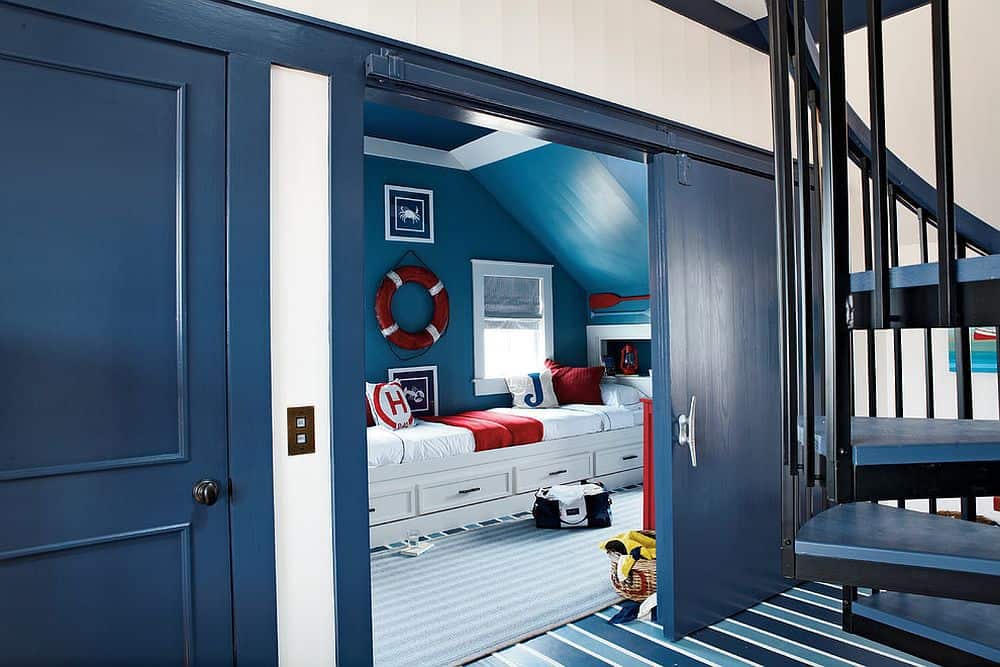
Blue paint colors to explore from Benjamin Moore
Purple
Purple signifies royalty, wealth, regality. It doesn’t occur all that often in nature, which is why in older times it was so highly regarded, along with blue. These rich dyes were expensive. Purple can be extravagant in deep jewel tones, or soft and sweet for a kids’ room. It pairs well with other colors, and can be fun to have in the mix. Designer Amanda Nisbet, the queen of color demonstrates excellently how to be bold and fearless with this color choice. From violet to fuschia she shows that purple can be executed in any area of the home.
“When designing a space the very first thing I think about is the mood of the room. Depending on the function and needs of my client, I question how we want to experience the room, how do we want to feel when we are in it? Then I consider the elements I feel are essential to a well designed space – comfort and elegance achieved through careful consideration of layout, form, scale, colour and texture.” – Amanda Nisbet
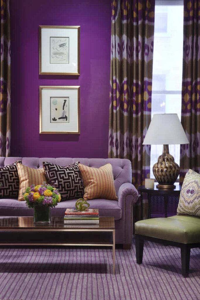
Check out these purple paints from Benjamin Moore
Tons of ideas here. If you’re thinking about some new color at you’re help, we’re happy to provide a free estimate. Request one now.

Katie Canfield is the founder and principal designer at Studio KC. Studio KC got its humble start in 2015 when Katie was just 23 years old. While she was freelancing with other interior designers in the NY and CT area she also became a go-to designer for local contractors and trades that needed a designer’s help for their clients whether it be for custom cabinetry drawings or plans for a gut renovation on an entire home.
Katie Canfield’s design aesthetic is eclectic and flexible. She delights in the marriage between old and new- keeping spaces approachable but still matching each client’s unique aesthetic and family narrative. Her passion for design keeps her motivated and constantly on the hunt for new trends and materials. Her broad experience includes an art history background, study at the Accademia Italiana in Florence, a stint with the renowned Manhattan firm Amanda Nisbet Design, as well as collaborations with builders and designers across the tri-state area. She’s seen it all: from gutting prewar Manhattan apartments to new construction in the ‘burbs.


