 by guest author Katie Canfield
When I say “wood panelling” do you cringe and get flashbacks to your parents’ 1970’s basement with orange shag carpet? Well, let’s fix that, because adding a wood panelling design to your home can quickly add valuable architectural detailing and really upgrade your space.
Wood panelling in the bathroom
Consider adding shaker style panelling to chair rain height around a powder room or full bathroom to make a statement. Save money on tile, but still add interest to your walls in a master bathroom. Take the panels all the way to the ceiling for a truly elegant look.
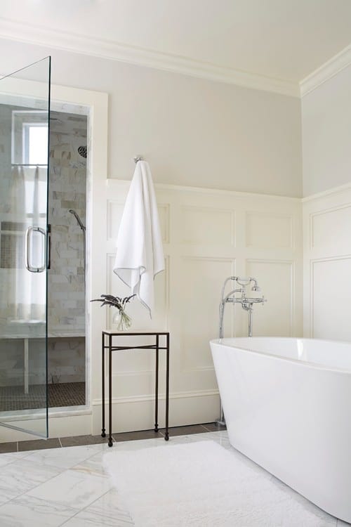
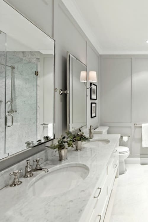
Getting Formal With Shaker Style Wood Panelling
Add a simple shaker panel to the walls in a powder room to make the space more formal. Use a high gloss lacquer, pearlescent paint, or a bold wallpaper to the wall space above.
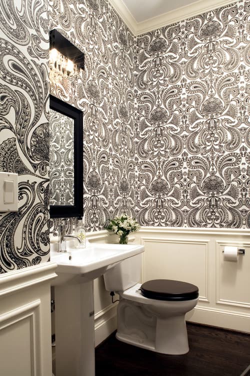 Having a nice clean panelling below can keep a bold wallpaper design from becoming overwhelming, and will reduce the amount of paper you need to purchase, so you can splurge and get something really special!
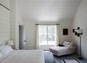
Use shiplap panelling to create the ever so popular contemporary farmhouse look. Go full height, or just halfway up.
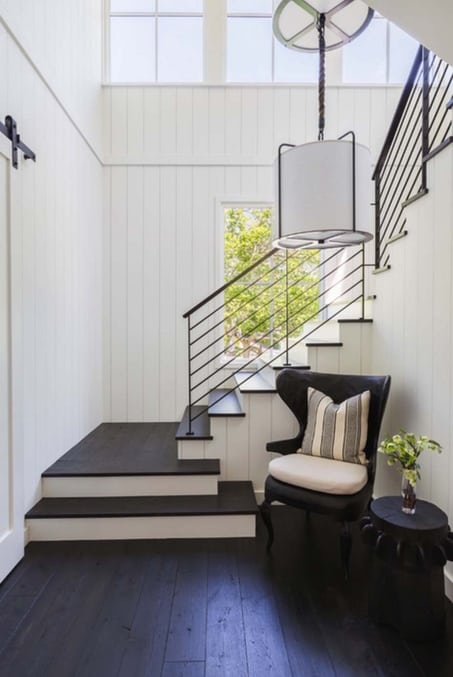
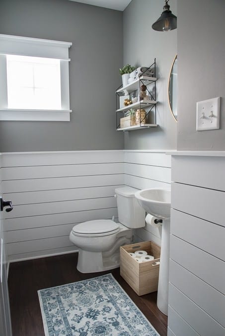
This adds interest to otherwise bare drywall, and with a satin or semi-gloss paint finish the surface is easily wipeable. A simple white shiplap is timeless, and relieves the stress of selecting a wall tile that will go out of fashion in a few years.
In the foyer
Again, the style of panelling will really set the mood of the space.
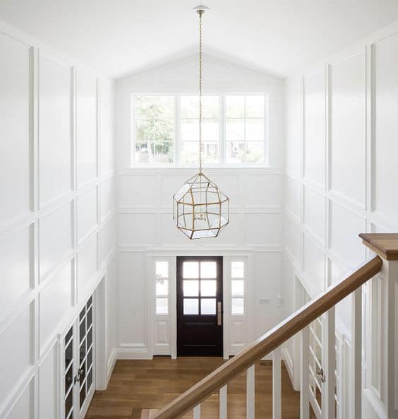
And what better way to introduce visitors to the personality of you and your home than at the entrance. Create a formal entryway and add drama with full height panels that have beading and other details.
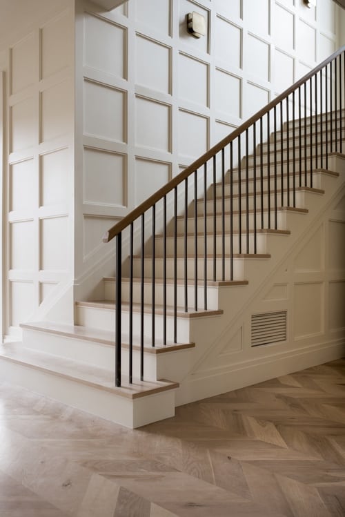
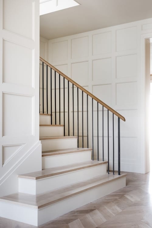
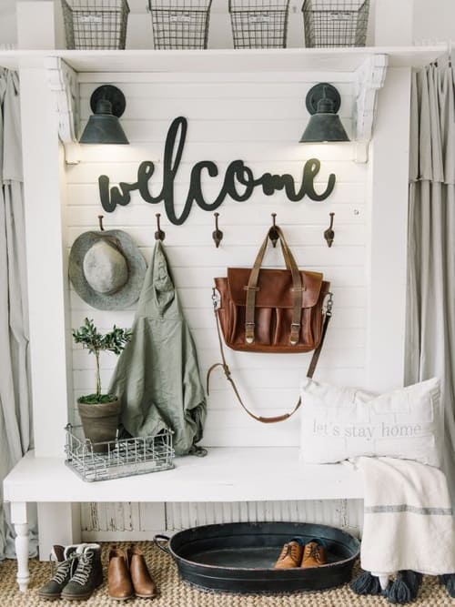
Maybe your house is on the water, and you want to capture that coastal feel. Maybe you have a farmhouse and you want your house to feel more casual. Adding shiplap panelling to your entryway will make your space feel more inviting and adds an airy freshness.
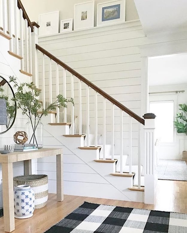
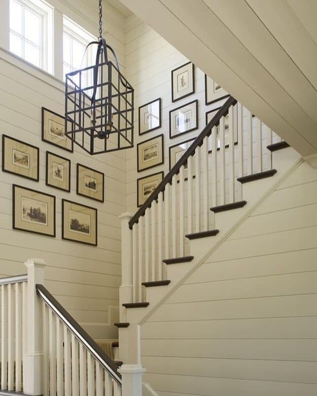
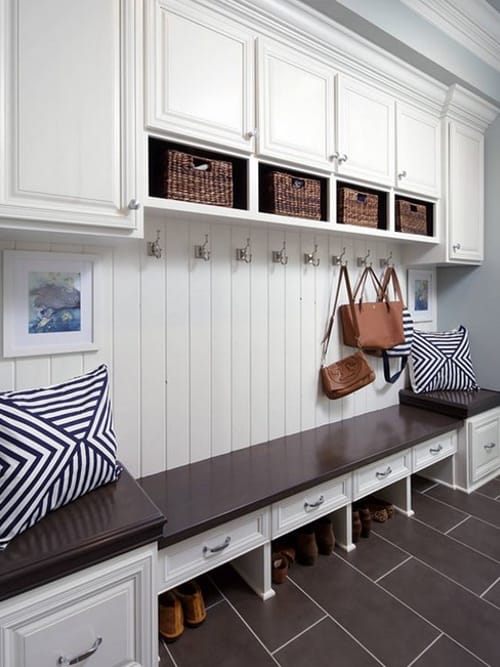
Running the boards vertical or horizontal gives off a totally different look. Enhance the height by running vertically, or elongate the space by running horizontal.
In the mudroom
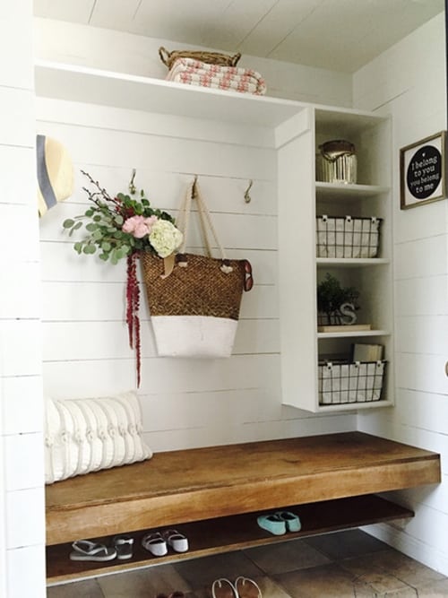
Usually this is the space where your family enters and exits the most. It is high traffic, and usually there are muddy boots being kicked off, sports gear gets tossed around and your walls, if left unprotected will take a beating. Again, in this area having wood panelling will stand up better to being knocked around and won’t ding or chip as easily. High gloss wood finish paints will also make the surface more easily cleanable.

Katie Canfield is the founder and principal designer at Studio KC. Studio KC got its humble start in 2015 when Katie was just 23 years old. While she was freelancing with other interior designers in the NY and CT area she also became a go-to designer for local contractors and trades that needed a designer’s help for their clients whether it be for custom cabinetry drawings or plans for a gut renovation on an entire home.
Katie Canfield’s design aesthetic is eclectic and flexible. She delights in the marriage between old and new- keeping spaces approachable but still matching each client’s unique aesthetic and family narrative. Her passion for design keeps her motivated and constantly on the hunt for new trends and materials. Her broad experience includes an art history background, study at the Accademia Italiana in Florence, a stint with the renowned Manhattan firm Amanda Nisbet Design, as well as collaborations with builders and designers across the tri-state area. She’s seen it all: from gutting prewar Manhattan apartments to new construction in the ‘burbs.


8 Comments