When undergoing a large renovation or remodel, windows sometimes come into play. Once you start playing around with windows you can open a big can of worms. There are so many things to consider, but don’t feel overwhelmed; we are here to help! Here are some ideas and things to consider when changing up and selecting windows for your home. From the perspective of an interior designer of course 😉
Window Placement For Remodels or New Construction
Interior designers and architects, despite having overlap, have different trains of thought when it comes to window placement. At times in my career I have been absolutely befuddled with window placement from an interiors perspective after looking at plans prepared by an architect. The front façade of your home might look beautiful, but that’s only curb appeal. If a window is placed too close to a wall, or in such a position that you can’t flank drapes comfortably on either side, your decorating plans will become a nightmare, or window casings can be stuck up against a wall awkwardly.
Pay attention to both the interior function and the exterior appearance!
I personally like to think of things in a hierarchy of importance. First, how does the location of this window impact the function of my space. Second, how do I address window treatments? Is my privacy important? Will I want drapes? Or will a shade suffice? If planning to accommodate drapes, you will want a minimum of 11-18” on either side of the window opening to have the drapes, and that’s if they are butting up against another surface. Third, how does this window placement impact my exterior elevations? Your front façade is always most important. Then depending on your plot, window placement on other elevations is less important. I can’t tell you how many times I’ve pulled my hair out over an awkwardly placed window on the interior, when a window was centered on some exterior fixture on a side elevation that no one was looking at. Always remember that you live inside of your home, and while the exterior should be beautiful, a window will always bother you more on the interior than it will from the exterior.
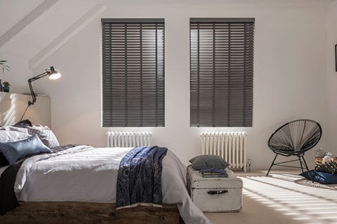
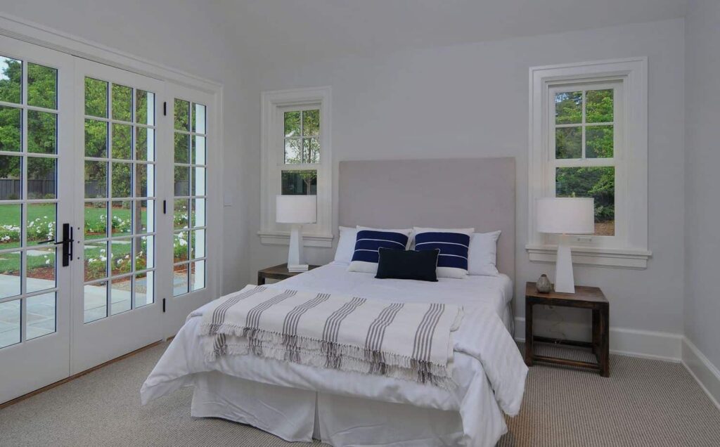

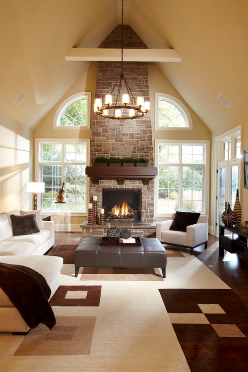
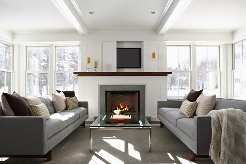
When it comes to windows you have to figure things from the inside and outside simultaneously! Otherwise you could be kicking yourself later when you get on to decorating!
Consider the Opening Style
More and more often it seems that double hung windows are the weapon of choice. Some people find the thick center bar restricting of a view, especially when you have a small 30” window in a bedroom. If you are replacing all your windows, there are so many options now with different aesthetics of light dividers, you may want to consider moving away from double hung, and more towards a casement style window. From an aesthetic perspective I think it allows for more options, and can be more contemporary. For a small square window, you might want to considering a flip out, rather than fixed.
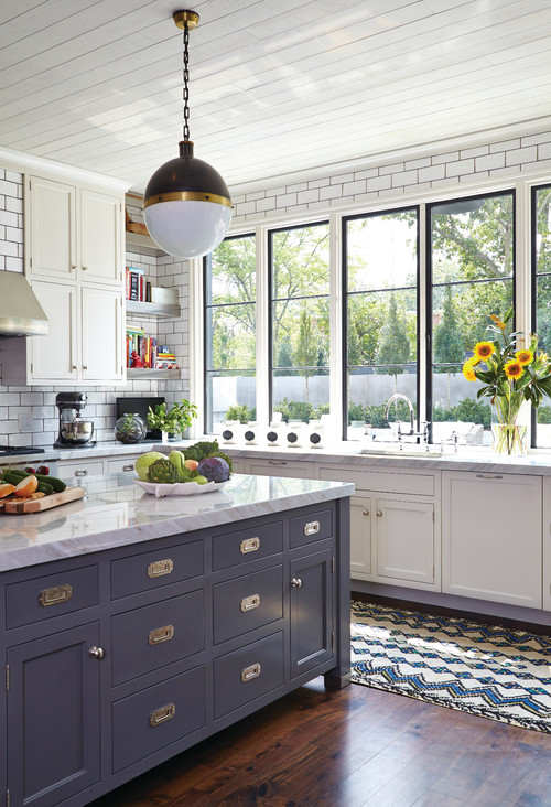
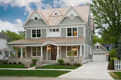
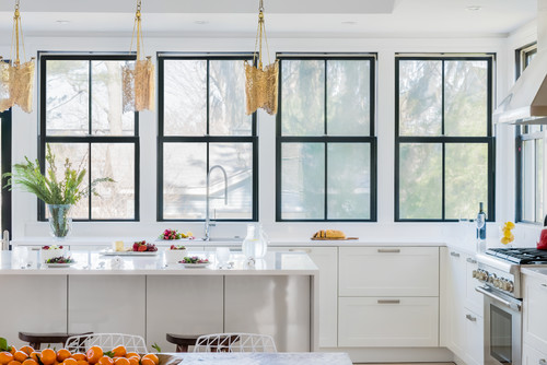
Black is the New Black
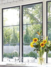
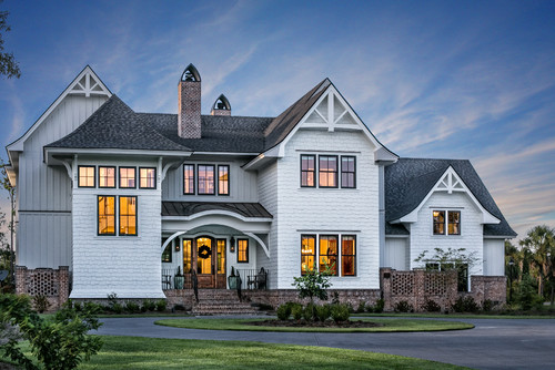
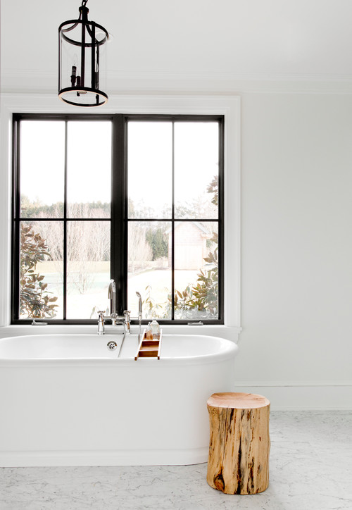
Black windows are SO hot right now. Everyone seems to want black windows on awhite home, especially for that farmhouse look. Don’t disregard white windows, it isn’t out of style. I do think black windows make a chicstatement, but I also think it’s timeless and won’t go out of style anytimesoon.
Think Outside the Box
Don’t be afraid to make a statement. Custom windows are very much a thing. Whether it be a picture window that’s juuuust the right size, or more of a specialty piece of glass, be patient, windows are an investment, trust the process and get the RIGHT thing. Maybe its leaded glass windows, instead of a typical wooden or vinyl light divider by the front door. Maybe you want seeded glass in a special place.
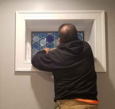
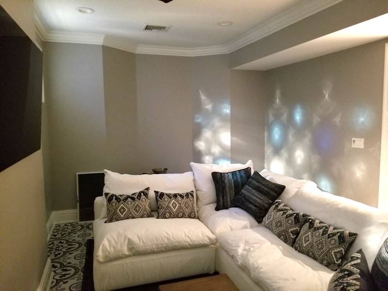
I’m currently working on a project where a client had 2 small transom windows in their basement living area. The windows are below grade in a window well with nothing of note to view. The client wanted to bring light into the space, but also some cheer and was looking at stained glass windows on Etsy. I knew just where to head, Rohlf Studio Glass. They do amazing custom stained glass window, leaded glass, and even do restoration work. They’ve worked extensively on Yale University in new haven and even do churches. We opted for a fun design of rondelles (Round blown glass pieces with a bullseye shape and texture) in a random mixture of seeded clear glass, light blue and a cobalt blue for a punch, the rondelles are pieced together with a leaded caming in a staggered pattern. From the exterior we are adding small lights into the window well to help bring a glow to the space at night! The sky is the limit, do not be afraid to push for something special if it’s what will make you happy!

Katie Canfield is the founder and principal designer at Studio KC. Studio KC got its humble start in 2015 when Katie was just 23 years old. While she was freelancing with other interior designers in the NY and CT area she also became a go-to designer for local contractors and trades that needed a designer’s help for their clients whether it be for custom cabinetry drawings or plans for a gut renovation on an entire home.
Katie Canfield’s design aesthetic is eclectic and flexible. She delights in the marriage between old and new- keeping spaces approachable but still matching each client’s unique aesthetic and family narrative. Her passion for design keeps her motivated and constantly on the hunt for new trends and materials. Her broad experience includes an art history background, study at the Accademia Italiana in Florence, a stint with the renowned Manhattan firm Amanda Nisbet Design, as well as collaborations with builders and designers across the tri-state area. She’s seen it all: from gutting prewar Manhattan apartments to new construction in the ‘burbs.


